LOS ALTOS, CA – August 7, 2025 – Kubit, the leading customer journey analytics platform, today announced the launch of Ask Kubit, a conversational AI interface that allows teams to ask questions in plain English and receive instant answers from their own data, no SQL or builder.
This new feature is designed to empower product managers, data analysts, and business leaders to access the insights they need faster and more intuitively. Built on the foundation of Kubit Lumos, Ask Kubit introduces explainable AI (xAI) into everyday analytics, further advancing the platform’s mission to make insights more accessible, transparent, and self‑service.
“At Kubit, we believe analytics should be as easy as asking a question,” said Alex Li, Founder & CEO of Kubit. “With Ask Kubit, any product manager, analyst or executive can simply type a question and our Lumos AI engine will interpret their intent and generate a complete report in seconds. By connecting directly to your data warehouse, we deliver answers with full transparency – no code, no bottlenecks and no black‑box logic.”
Key Capabilities of Ask Kubit
Natural Language Questions: Simply ask a question in everyday language; Ask Kubit translates it into a query and delivers the answer with context and clarity.
Smart Suggestions: Users receive AI‑powered follow‑up questions and related queries to deepen their analysis without needing to leave the interface.
Source‑of‑Truth Metrics: Answers are generated directly from your data warehouse and governed metrics, ensuring transparency and trust.
Integrated with Lumos: Ask Kubit is built on Kubit Lumos, extending its NLP, summarization and AI capabilities into a fully conversational experience.
With Kubit Lumos, the guiding principle was to build an AI tool that’s genuinely useful, transparent and trustworthy. Kubit reduced hallucinations and harnessed the secure metadata already shared with Kubit to deliver accurate, context‑aware responses, hallmarks of true explainable AI.
Ask Kubit is now available to Enterprise customers. By combining AI‑powered discovery with a warehouse‑native architecture, Kubit continues to eliminate data silos, empower self‑service analytics and reduce the time between question and answer, while keeping teams in full control of their data.
“As we bring AI deeper into analytics, transparency matters more than ever,” added Jeremy Benza, VP of Product at Kubit. “Ask Kubit makes it easy for anyone to explore data by simply asking a question, but the real value lies in how we deliver the answer. Because Ask Kubit runs directly on your cloud data warehouse, there’s no hidden layer or black‑box logic, ensuring that every response is grounded in governed, reliable data. That’s what makes it explainable AI, not just AI.”
About Kubit
Kubit is a transparent customer journey analytics platform that connects directly to your data warehouse: no duplication, no silos, no confusion. Everyone works from the same trusted source with full visibility into the SQL behind every report. Kubit unifies insights across every stage of the user journey – without ETL headaches – adapts to any data model, and delivers self-service exploration powered by Lumos AI. By bridging technical and business teams, Kubit accelerates time-to-insight and drives product growth with clarity and trust.
Lessons from a Familiar Pattern and Why It’s Happening Again
Before joining Kubit, I spent several years at Tableau during a time of real industry change. Most analytics tools were controlled by technical teams. Business users may have had access to reports, but they were entirely dependent on what the “report factory” delivered. Tableau changed that. It gave business users the power to explore data on their own, which fundamentally changed how decisions were made.
I watched that shift unfold across thousands of customers. As access improved, teams moved faster. People started trusting the data, asking sharper questions, and driving real impact. Tableau didn’t just deliver dashboards. It delivered confidence.
That experience shaped how I think about disruption. And it’s exactly what brought me to Kubit.
Transparent Customer Journey Analytics and Why It Matters Now
Today, I see a similar pattern in Customer Journey Analytics.
Product teams, marketers, and analysts all want to understand how users interact with digital experiences. But instead of clarity, they get a mess of disconnected tools, mismatched metrics, and dashboards that require constant explanation. The same problems we saw with early BI are showing up again.
That’s where Kubit comes in. We call it Transparent Customer Journey Analytics.
Kubit connects directly to your data warehouse. There’s no duplication, no proprietary layer, and no confusion about what’s right. Everyone, from analysts to product managers, works from the same trusted data, with complete visibility into what drives each report.
Just like Tableau broke through rigid workflows, Kubit removes friction and empowers people to get real answers fast.
I’ve Seen This AI Story Before Too
We’re also watching something similar unfold with AI.
A lot of legacy vendors are losing ground and scrambling to stay relevant by adding an AI wrapper to aging platforms. They invest heavily in custom demos and hand-built solutions that look impressive in a pitch but rarely scale. What customers actually get is a services engagement, not a repeatable product that delivers long-term value.
Lumos is integrated into our core platform, designed to scale across use cases and users. This isn’t a one-off solution or custom overlay. Features like Ask Kubit allow anyone to generate insights using natural language, without relying on a data team. Once enabled, it works with your existing data model, no special configuration or services required. That means faster access to answers and a clear path to value, without introducing another layer of complexity.
Time to Value Is What Matters Most
Every disruptive product wins the same way: by delivering value faster than what came before.
Tableau won because people could finally answer their own questions without waiting. Kubit wins because we remove the chaos of fragmented product analytics and bring everyone to the same source of truth.
Today’s data stack is powerful, but it’s also complicated. Leaders are realizing that stitching together four tools just to answer one question isn’t sustainable. They want one place to understand how their product is performing and why.
Kubit delivers that clarity with speed, trust, and simplicity.
Choosing the Right Problem to Solve
When I found Kubit, I recognized the signs.
The problem was clear. The need was urgent. And the team had built something focused, smart, and refreshingly honest. Kubit isn’t trying to do everything. It’s solving a specific problem that every modern team runs into. And it’s doing it with transparency and precision.
At Kubit, we respect both the data and the people who rely on it. We cut through the noise, deliver answers quickly, and give users confidence in every decision by leveraging data directly from where it belongs: the warehouse.
I’ve seen this movie before. The players may be different, but the story feels the same. When timing, product, and need align, big shifts happen.
That’s the moment we’re in. And I’m excited to be a part of it.
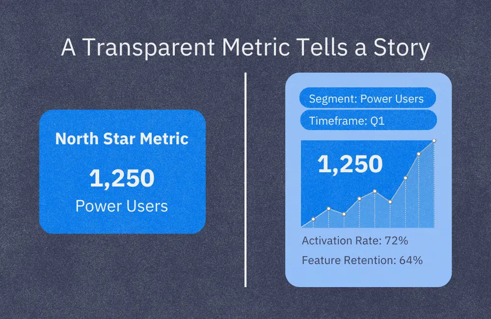
The North Star Metric has become a staple in product strategy. It promises clarity, alignment, and a unified focus across teams. In theory, it’s the one metric that shows whether your customers are receiving value and whether your business is growing as a result.
But here’s the catch: most teams don’t stop to question what’s behind the number.
They see the chart and chase the trendline, but rarely ask, “Where is this coming from? What’s influencing the rise or fall? Can we trust it?”
If a North Star Metric can’t be explained or explored, it’s just a number on a screen – not a source of truth.
What Makes a North Star Metric Useful?
At its core, your North Star Metric should reflect how well you’re delivering value to your users. It offers a shared goal that connects departments; whether you’re in product, marketing, customer success, or operations.
A strong North Star Metric has three key qualities:
It reflects meaningful customer value
It can be influenced by your team’s efforts
It acts as a leading indicator of long-term growth
When those conditions are met, your North Star Metric becomes a powerful decision-making tool. It helps teams align priorities, measure impact, and move forward together.
The Real Problem: You Can’t Act on What You Can’t See
Many teams adopt a North Star Metric because they’ve been told it’s a best practice. They choose a number, display it on a dashboard, and assume it will guide decisions.
But what happens when it stalls, spikes unexpectedly, or starts to lose relevance as the product evolves?
In many cases, no one knows the reason behind the change.
This is what we call the Visibility Gap – the disconnect between a company’s most important metric and their ability to understand or investigate it.
When a metric is divorced from its source, it loses its influence. Teams begin to question its accuracy. Decisions slow down. Alignment breaks down.
What Visibility Really Means
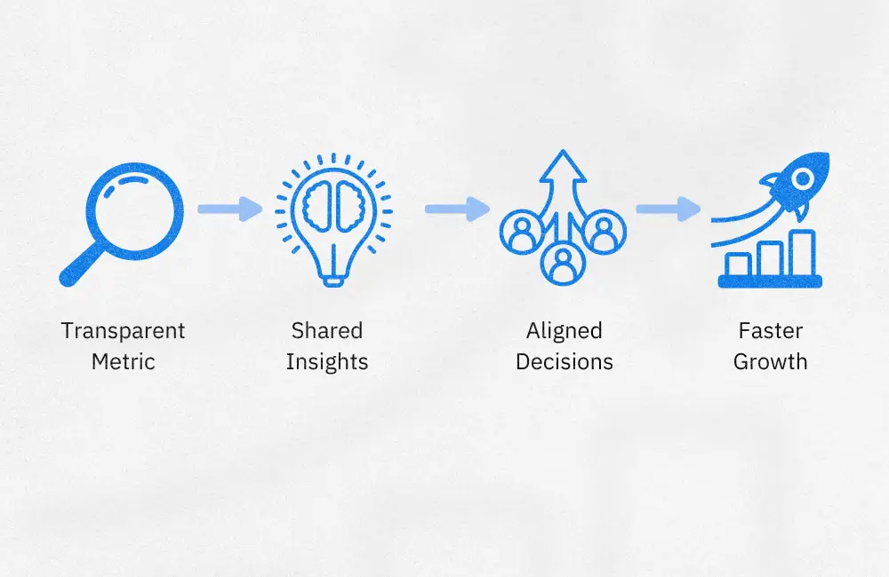
Visibility isn’t just about displaying a number. It’s about being able to trace its meaning and origins.
A transparent North Star Metric empowers your team to:
Understand the logic and data sources behind the metric
Break it down by customer segment, behavior, or timeframe
Explore patterns or anomalies without relying solely on analysts
Identify early signs of change in the supporting data
With this level of insight, your team can shift from reactive reporting to proactive strategy.
A New Way to Think About Your North Star
Rather than treating your North Star Metric as a static headline number, consider it a living reflection of customer value. It should evolve as your product grows and your users’ needs shift.
Supporting metrics, like activation rates, feature-level retention, or onboarding completion, add depth to your understanding. They don’t replace the North Star, but they provide the necessary context to act on it with confidence.
These metrics matter most when they’re clearly tied to your core metric and easy to access across teams. When both the primary and supporting metrics are transparent, teams gain more than visibility. They gain momentum.
Take a quick walkthrough of Kubit to see how teams explore their North Star Metric, and everything behind it, without writing a single line of SQL.
You Can’t Align Without Trust
Alignment is easy when everything is going well. But the real test comes when metrics change, priorities shift, or teams need to pivot quickly.
That’s when clarity matters most. And clarity depends on having data that is accessible, trusted, and easy to explore.
If your North Star Metric feels more like a mystery than a compass, it might be time to take a step back. Revisit what it’s measuring. Reassess how it’s defined. And ask whether your team has what they need to trust it.
Because a great metric isn’t just something you track. It’s something your entire team should understand and use every day.
Want to see what full transparency looks like?
Let’s talk about how Kubit can bring your North Star Metric into sharper focus—no black boxes, no delays, no guesswork.
As businesses increasingly rely on data for decision-making, maintaining control over that data has become a critical priority. Many analytics platforms store sensitive information in third-party silos, creating duplication and reducing transparency. Enterprises now realize that without full control over their data and one single source of truth, their governance, security, and privacy are all compromised.
The lack of visibility into how insights are generated from third-party data silos—often through opaque, “black box” processes—raises serious doubts about the integrity of those insights. Without a direct connection to the data, it’s nearly impossible to trust the analytics produced. Data security isn’t just about compliance; it’s about ensuring that the insights you rely on are accurate and actionable.
Customer Data Security: Why Traditional Solutions Fall Short
Many analytics platforms store data in proprietary infrastructures or third-party silos, enabling quick querying but compromising security in the process. This approach may save time in the short term, but it can create long-term vulnerabilities for enterprises.
Here’s where traditional solutions fall short:
Data Duplication: Storing data outside your warehouse introduces multiple copies, increasing the risk of breaches.
Complex Data Protection: Special care must be given to protect PII (Personally Identifiable Information) from leaking. Privacy and compliance is a nightmare to guarantee.
Black Box Insights: Using platforms that hide the data processing and analysis mechanisms creates a lack of trust in the accuracy of your insights.
Fragmented Data: Data scattered across silos prevents a cohesive understanding of your customers’ complete journey through analytics, leading to inconsistent insights.
Recent statistics underscore the risks: 61% of companies have reported being breached due to vulnerabilities in third-party systems, and 80% of organizations have experienced a third-party data breach (Source: Prevalent). Enterprises are increasingly aware that they can’t maintain full data governance if their sensitive information is replicated and stored in third-party systems they don’t control. The lack of visibility into how data is processed also creates problems for organizations trying to ensure integrity in their reporting.
The Key Elements of Strong Data Security and Integrity
Focusing on customer data security allows businesses to address common risks, such as unauthorized access, data breaches, and regulatory violations. Here’s how securing your data benefits enterprises—from travel and hospitality brands, to ecommerce and media:
Data Control: You keep data in your own warehouse—under your data governance preferences—preventing unnecessary exposure and duplication.
Transparency: Full access to the data processing methods means you can trust the insights your business relies on.
Compliance Assurance: Adhering to industry standards like GDPR helps mitigate the risk of non-compliance and associated penalties.
Without data security, your insights can become unreliable, undermining decision-making across your organization. Ensuring that the data used for analytics is secure, transparent, and compliant isn’t just about protecting your business—it’s about making informed, accurate decisions.
How Kubit Protects Data Security and Privacy
Unlike traditional platforms that move or duplicate your data, Kubit keeps your data where it belongs—in your data warehouse. By querying the data directly rather than creating copies, Kubit reduces the security risks that come with third-party storage and gives you full transparency over your analytics process. Kubit is SOC2 Type 2 compliant, which ensures that sensitive data is protected through rigorous security controls.
With Kubit, you get:
Secure Analytics: No unnecessary data duplication, no third-party silos—just secure, direct access to your data.
Full Visibility: You can see how data is processed and understand how insights are generated.
Compliance Ready: Kubit is built to meet GDPR and other data privacy regulations, giving you peace of mind.
Kubit’s approach to customer data analytics security ensures that your organization has the control, transparency, and compliance necessary to make confident decisions backed by secure data.
Securing Customer Data for Accurate, Reliable Analytics
When it comes to customer data analytics security, the risks of relying on platforms that store or duplicate your data in third-party systems are clear. Without proper security, transparency, and control, your data can’t be trusted to drive decisions. By leveraging a solution like Kubit, which keeps your data in your warehouse and provides full visibility, you can protect your customer data while maintaining the integrity of your analytics.
LOS ALTOS, March 18, 2025 – Kubit, a leading customer journey analytics platform, has announced the launch of Kubit Lumos, an AI-powered analytics engine designed to revolutionize how enterprises extract value from their existing data warehouse.
Kubit Lumos leverages AI, natural language processing (NLP), and machine learning to streamline analytics reporting, optimize workflows, and ensure data quality—equipping product and data teams with in-depth, actionable insights to optimize product performance and the customer experience.
“Kubit Lumos is a game-changer for organizations looking to bridge the gap between complex data and decision-making,”said Alex Li, CEO of Kubit.“By embedding AI-powered analytics directly into our flexible and transparent platform, we’re helping teams make smarter, faster, and more confident business decisions—without the burden of data silos, rigid data models or expensive engineering resources.”
Core Functionality of Kubit Lumos:
Data Insights: Highlight key trends and insights from reports with AI-generated summaries, delivering meaningful context and helping you spot details at a glance.
Intuitive Language: Unlock deeper insights into your data with Natural Language Processing, simplifying the process of finding and understanding the insights you need.
Optimize Workflows: Identify repetitive queries, receive suggestions on the next best actions, and get recommendations for relevant saved entities.
Ensure Data Quality: Safeguard your data quality with query efficiency reports and real-time alerts for admins to address data issues promptly.
With Kubit Lumos, enterprises gain the power of AI without losing control of their data. Unlike traditional analytics tools that require data extraction, Kubit keeps customer journey insights directly within the source data infrastructure, ensuring full transparency, governance, and flexibility.
“Kubit Lumos ensures teams have access to trusted, AI-driven analytics while maintaining full visibility and confidence in their metrics,” added Li.
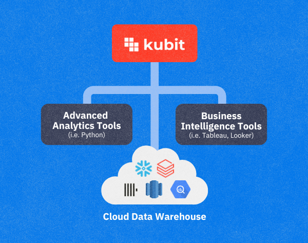
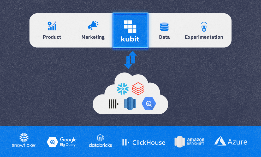
Kubit is the leading Customer Journey Analytics platform for enterprises. Through a revolutionary warehouse-native approach, Kubit empowers teams with self-service insights, rapid decision-making, and full transparency without engineering dependencies or vendor lock-in.
Unlike incumbent solutions, Kubit eliminates data silos and black boxes, allowing enterprises to analyze customer behavior directly from their existing data infrastructure like Snowflake, BigQuery, or Databricks. Kubit provides the flexibility to unlock actionable insights from custom data models with both clickstream events and operational data, without compromising governance or control.
Enterprises like Paramount, TelevisaUnivision, and Miro trust Kubit not only for its agility and reliability but also for its unmatched customer support with expert guidance and a customer-first approach that ensures success at every stage.
When people hear AI, they often think of artificial intelligence—a powerful technology transforming industries. But at Kubit, we view AI differently. For us, it stands for Analytics Intelligence, an approach that prioritizes data transparency over the complexities artificial intelligence can create when applied to misunderstood data.
Artificial Intelligence and Misunderstood Data: Adding to the Confusion
While artificial intelligence has immense potential, applying it to poorly understood or siloed data often worsens confusion. It’s similar to automating a flawed process—you’re simply accelerating the problem. When AI is layered on top of this kind of data, the results are typically conflicting insights, incomplete answers, and poor decision-making.
A 2023 report by Forrester found that 60% of decision-makers struggle to trust the data output from AI-driven systems. This is largely due to black-box AI systems, which offer no visibility into how data is processed. Business leaders are often left in the dark about how insights are generated, which breaks down trust and leads to inefficiencies. Moreover, relying on AI to run complex queries without understanding the data sources can be extremely expensive.
The solution? Embrace Analytics Intelligence and lean into data transparency.
Kubit’s Approach to Transparency: Analytics Intelligence in Action
At Kubit, we believe in empowering businesses with full visibility into their data, enabling them to understand and trust the information driving their decisions. Here’s how we make that happen:
1. Open Data Sources and Streamlined Systems
Traditional product analytics solutions, like Amplitude, operate within a black box, leaving users in the dark about how insights are generated. Kubit takes the opposite approach: we open up data sources so users can see exactly where their data comes from and how it’s processed. This transparency eliminates confusion and reduces errors caused by disconnected or misaligned systems.
2. SQL Visibility After Reports Are Built
A common frustration with AI-driven data solutions is the inability to understand how reports are created. At Kubit, we provide full SQL visibility after reports are built. Users can see the exact queries behind every report, giving them full transparency into the logic and calculations used.
This level of insight helps users:
Identify errors or inconsistencies in reports
Troubleshoot issues when data seems off
Refine reports and queries as needed, without guesswork
3. Self-Service Access to Data
Traditional AI systems often centralize data access, making business users reliant on data teams to pull reports or run queries. Kubit changes this dynamic by offering a self-service model, allowing users to access data independently, without needing a data team to mediate.
Benefits of self-service data include:
Faster decision-making
Less dependency on technical teams
Increased agility across departments
4. Removing Data Silos by Keeping All Data in the Warehouse
Data silos—isolated pockets of information stored in different systems—can cause discrepancies and confusion. Many AI systems only layer additional complexity on top of this fragmented data. Kubit solves this problem by keeping all data in the data warehouse, ensuring everyone operates from a single source of truth. This eliminates silos and allows teams to collaborate using consistent, reliable data.
A Future Built on Analytics Intelligence
As businesses grapple with increasing data complexity, relying solely on AI-driven black-box solutions can be risky. The better approach is Analytics Intelligence, which emphasizes transparency and accessibility.
Kubit’s focus on open data sources, SQL visibility, and self-service data access empowers companies to make smarter decisions, faster—without the confusion and inefficiencies artificial intelligence can sometimes create. By keeping all data in the warehouse, we ensure there are no silos, only clear, actionable insights that drive business success.
Discover Kubit
Activate your warehouse data with complete analytics.
With recent shifts in the product analytics landscape, Kubit stands apart as the only warehouse-native solution that remains independent of any specific use case or integration partner. While some competitors are being acquired by larger platforms and shifting their focus to MarTech, Kubit continues to focus on delivering clear, accurate data insights directly from the customer’s cloud data warehouse. Instead of getting distracted by expanding into other fields, Kubit stays committed to its core mission: providing data transparency and control to help businesses democratize analytics and make smarter, faster decisions.
Why Focusing on a Data Visibility Solution Matters
The traditional method of moving data into third-party data silos and analytics tools (via ETL processes or SDK) has several drawbacks, and Kubit’s focused approach directly addresses these issues:
Scaling and resource constraints: As data requests increase, traditional platforms struggle to scale efficiently, often leaving teams waiting for insights.
Errors and confidence: Moving data to third-party tools introduces risks of inaccuracies, diminishing trust in the analytics provided.
Inefficiencies: Teams often waste time fixing issues introduced by complex integration processes.
Security concerns: Transferring sensitive data to external systems adds potential security vulnerabilities.
Kubit solves these problems by keeping everything within the customer’s chosen data warehouse. Our platform integrates directly with the source, avoiding the need to move data into multiple systems. This focus on data visibility, without unnecessary complexity, ensures that our users can trust their data—every time.
Speed and Agility
Large, one-size-fits-all platforms often suffer from long development cycles due to their complex roadmaps, which try to satisfy various customer needs across different industries. At Kubit, our focus allows us to be agile and responsive to customer requests. Rather than waiting years for features that are deprioritized in favor of more generalized tools, Kubit delivers quick, impactful updates that directly address the challenges facing data organizations today.
Faster implementation: Our platform has seamless No-Code integration, allowing customers to gain insights within 10 days.
Continuous innovation: We rapidly introduce new features weekly based on customer feedback, maintaining a competitive edge.
Staying Warehouse Independent
One of Kubit’s greatest strengths is our warehouse independence. While we partner with all major data platforms like Snowflake, BigQuery, Databricks, Redshift and ClickHouse, we remain agnostic, ensuring customers are not locked into any single ecosystem. This flexibility allows data teams to use the infrastructure that best suits their needs, without sacrificing performance or control.
By remaining warehouse-independent, Kubit enables customers to keep control of their data infrastructure while maximizing the value of their analytics.
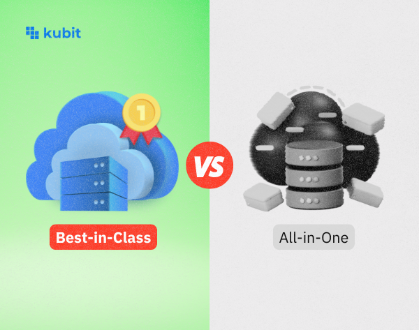
Why Best-in-Class Beats All-in-One
All-in-one platforms often promise the world, but their focus is spread too thin. The favoritism of one specific set of data over another completely misses the point of data insights from a central warehouse. This skew in focus results in bloated systems full of features that most users don’t need. In contrast, Kubit’s best-in-class approach is laser-focused on solving real problems for data teams. Whether it’s providing product analytics, executive dashboards, or improving decision-making through data democratization, our mission is clear. Kubit is focused on being the best at what we do, providing superior data visibility and analytics solutions to every team throughout an organization.
Conclusion: Simplicity Drives Success
As the data analytics industry continues to evolve, it’s clear that simplicity and specialization are the keys to success. Kubit’s warehouse-native approach empowers data teams to maintain control of their data without the overhead or complexity of large, all-in-one platforms. By staying focused on data transparency and flexibility, Kubit delivers faster, more reliable insights, helping businesses make better decisions.
Recent events only validate our approach, and we’re excited to continue leading the charge in warehouse-native analytics, putting data visibility and customer needs at the forefront.
ClickHouse and Kubit are a match made in data heaven. Together, they form a powerful combination that enables fast, efficient, and scalable analytics for modern businesses. In this guide, we’ll explore how ClickHouse’s architecture works seamlessly with Kubit’s customer analytics platform, enabling you to leverage the full potential of your data.
ClickHouse Architecture Overview
ClickHouse is a columnar database management system (DBMS) designed for online analytical processing (OLAP). Its architecture is optimized for handling large-scale data queries, making it ideal for big-data applications.
Some key features of ClickHouse’s database architecture include:
Columnar data storage for faster query processing
Parallel execution for scalability and speed
Compression techniques that reduce storage costs
These features ensure that Kubit’s analytics platform performs at top speed, handling complex queries with ease.
How to Optimize Your ClickHouse Queries
To get the best performance from ClickHouse, especially when integrated with Kubit, it’s crucial to understand ClickHouse internals. This deep understanding allows you to optimize query performance by focusing on:
Using partitioning to break down large datasets for faster query response.
Optimizing index usage to narrow down the search space for queries.
Batch inserting data to avoid frequent minor updates that may slow down performance.
At Kubit, we leverage these techniques to ensure your data queries are fast and cost-efficient.
Benefits of ClickHouse’s Architecture
The architecture of ClickHouse makes it an ideal solution for businesses that require high-performance product analytics, such as those powered by Kubit. Its scalability allows it to handle millions of rows of data without compromising performance, ensuring seamless operations even at large data volumes. The system’s efficiency shines through with parallel query processing, delivering near-instant results for complex data sets. Additionally, the columnar storage format offers flexibility, giving businesses greater control over how their data is queried and analyzed to gain actionable insights.
These features help large-scale organizations democratize data, making it accessible to more teams across the business.
ClickHouse Use Cases
ClickHouse is the go-to solution for organizations that handle data from millions of users, particularly in consumer applications and high-volume SaaS products. Its performance is crucial for industries such as e-commerce and media, where businesses rely on real-time data to track customer behavior, and when capturing content performance and audience engagement is critical to driving user retention and growth.
SaaS companies use it to monitor product usage and engagement metrics at scale. Kubit leverages this power for both product and customer analytics, delivering fast, actionable insights that can be easily visualized in executive dashboards. This makes it the ideal platform for businesses looking to turn massive data streams into clear, strategic decision-making tools.
How to Get Started with ClickHouse
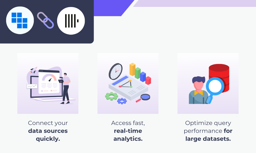
To begin utilizing ClickHouse with Kubit, simply integrate ClickHouse as your backend database for analytics. Kubit’s platform is designed to integrate with ClickHouse, allowing you to seamlessly:
Connect your data sources quickly
Access fast, real-time analytics
Optimize query performance for large datasets
With Kubit’s streamlined setup and expert customer success team, you’ll unlock ClickHouse’s full potential, effortlessly optimizing performance and scalability. Complex datasets become actionable, giving teams across your organization visibility into critical insights. This visibility allows for data-driven decisions and business improvements, empowering more of your team to operate effectively and align on strategic goals.
FAQs
What is ClickHouse?
ClickHouse is a columnar DBMS designed for fast query processing of large datasets in OLAP scenarios.
Which engine does ClickHouse use?
ClickHouse uses a MergeTree engine, allowing partitioning, indexing, and replication.
What language does ClickHouse use?
ClickHouse uses SQL as its query language, making it accessible to most data engineers.
What is a DBMS?
A DBMS (Database Management System) is software used to store, retrieve, and manage data.
Ready to move on from Amplitude, or want to explore other options? Read this blog post to get a better understanding of vendors that offer similar solutions to Amplitude, their target use cases, key features, and customer ratings.
Analytics for insight on digital product usage, customer journey, and business intelligence
What is Amplitude?
Amplitude is a product analytics platform that helps businesses build better digital products by tracking and understanding user behavior. Amplitude analytics help teams answer questions about what happened and why. These insights enable informed decision-making to drive growth.
Businesses use Amplitude to:
Analyze active users
Understand customer value
Accelerate monetization
Increase user engagement and retention
Improve the customer journey
Maximize user adoption
Drawbacks to using Amplitude
Choosing the right analytics platform for your use case is critical for success. Many analytics vendors are on the market, and each has its own strengths (and drawbacks), depending on the use case it’s implemented for. Some drawbacks to using Amplitude include:
It’s not warehouse-native. With Amplitude, you must move or replicate your data for analysis, so your data will not represent a 100% complete, up-to-date picture.
Higher cost of ownership. Amplitude requires additional engineering resources to transform data into a certain format, include historical data, expunge data, or add new schemas to it.
Limited permissions. While other product analytics vendors offer custom, role-based permissions, Amplitude offers only four out-of-the-box roles.
Data security. With Amplitude, your data must leave the walls of your CDW to be analyzed, potentially causing security or compliance risks.
Data analysis. Amplitude offers common analysis types but does not include capabilities such as and/or with filters, creating filters on the fly, out-of-the-box sampling, access to SQL behind each query, or creating histograms on the fly.
Top 9 alternatives to Amplitude, by use case
#1 Kubit
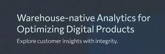
Use case: Warehouse-native analytics for optimizing digital products while ensuring data security, compliance, and scalability.
Kubit analytics platform helps companies gain valuable customer insights without moving their data into silos. This warehouse-native approach lowers the cost of ownership, frees up engineering resources, and delivers more accurate and complete self-service insights.
Key features:
User engagement: Find out which user behaviors lead to higher lifetime value and how to retain and grow your user base.
Feature engagement: See which product bets drive the highest engagement and create power users within your product.
Conversion analysis: Learn how users convert through critical funnels within your product and how to resolve areas that lead to drop off.
Consumption patterns: Understand which product bets and content to play up and which to sunset.
Use case: Analytics for learning how and why people engage, convert, and retain (across devices) to improve their user experience.
Mixpanel is a digital analytics platform that helps companies measure what matters, make decisions fast, and build better products through data with self-serve product analytics solutions.
Key features:
Product analytics: Track user behavior, KPIs, and core metrics with trends, retention, and flows.
Collaborative boards: Build analysis in collaborative boards that can include reports, text, videos, and GIFs.
Alerts: Get automated notifications when there are anomalies in metrics or when they fall outside of an expected range.
Filtered data views: Hide and filter data on a per-team basis to protect data privacy and reduce noise.
Use case: Analytics for improving the customer journey and testing new features and experiences.
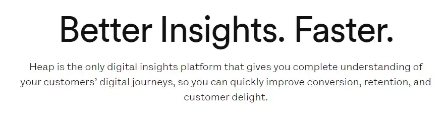
Heap is a digital insights platform that helps companies understand their customers’ digital journeys so they can quickly improve conversion, retention, and customer delight.
Key features:
Session replay: Get insights about user behavior by replaying their session to understand where they experience friction.
Heatmaps: A visualization of a user’s behavior on the page, including what they click on, how far they scroll, and where they focus their cursor.
Autocapture: Capture all the data you need automatically, including every view, click, swipe, and form fill, for web and mobile.
Segments: Create user cohorts based on real actions taken on your site or app to understand how different users navigate your digital experience.
Use case: Product analytics, in-app guides, session replay, and user feedback.
Pendo is a product experience platform that helps teams deliver better software experiences and increase product adoption through onboarding users, tracking adoption analytics, monitoring usage patterns, and measuring churn rates.
Key features:
Product analytics: Collect app and user data and learn from the past to make informed decisions that improve product adoption.
Session replay: Watch video playbacks of user sessions to understand why users do what they do.
In-app guides: Deliver personalized guidance to customers directly inside your app.
Product-led growth: Drive better customer retention, conversions, and engagement with less time and expertise.
Use case: Analytics for increasing product adoption, improving onboarding, and supporting product-led growth.
Userpilot is an all-in-one platform for Product & UX teams. It combines product analytics, in-app engagement, and in-app surveys to help you increase product adoption through powerful in-app experiences, actionable product analytics, and user feedback.
Key features:
Feature tags and heatmaps: Tag certain UI elements and monitor how users interact with them; visualize data through color-coded heatmaps.
Custom event tracking: Track relevant milestones in a customer journey that reflect desirable user behavior, like downloading a Chrome extension, and then monitor how many users behave in that manner.
Analytics dashboards: Track product usage metrics such as the number of active users, sessions, average session duration, and feature adoption rate from a single view.
Funnel analysis: Track how users progress through different user funnels, enabling you to discover friction points in the user journey and optimize them to improve the user experience.
Use case: Analytics for websites, iOS/Android apps, and various frameworks that answer the “why” behind user actions.
Smartlook gathers brands’ app data together on one central dashboard to provide clear, data-driven decision-making for product managers, marketers, UX designers, and developers to reduce churn rates, boost conversions, identify and fix bugs, and improve UX.
Key features:
Session recordings: Evaluating user recordings can reveal issues with your app or website.
Events: Find out how often users perform certain actions that are important to you.
Funnels: Find out where and why your users are dropping off, so you can improve.
Heatmaps: Get an overview of where your users click and how far they scroll.
Use case: Freemium analytics service for gaining insight into website and app behavior, user experience, and marketing efforts.
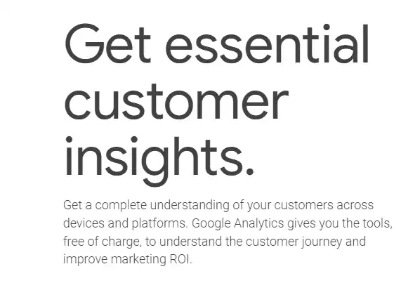
Google Analytics collects website and app visitor data to help businesses determine top sources of user traffic, gauge the success of their marketing campaigns, track goal completion, discover patterns and trends in user engagement, and obtain visitor demographics.
Key features:
Built-in automation: Get fast answers to questions about your Google Analytics data, predict user behavior, and tap into powerful modeling capabilities.
Reporting: Dive deeper into the ways customers interact with your sites and apps with real-time reporting, acquisition reports, engagement reports, and monetization reports.
Advertising workspace: Understand the ROI of your media spend across all channels to make informed decisions about budget allocation and evaluate attribution models.
Explorations: Run deeper, custom analysis of your data without the limitations of pre-defined reports, and share insights with other users.
Use case: Analytics for insight on digital product usage, customer journey, and business intelligence.
Netspring is a product and customer analytics platform that brings the modeling flexibility and exploratory power of business intelligence to self-service product analytics, working directly off of any cloud data warehouse.
Key features:
Self-service: Self-serve answers questions from a rich library of product analytics reports, with the ability to pivot back and forth between any report and ad hoc visual data exploration.
Warehouse-native: Combine product instrumentation with any business data in your data warehouse for context-rich analysis.
SQL option: Avoid writing and maintaining complex SQL for funnel/path-type queries, but have the option of leveraging SQL for specialized analysis.
Product and customer analytics: Solutions for behavioral analytics, marketing analytics, operational analytics, customer 360, product 360, and SaaS PLG.
Use case: Combining product analytics, session replay, feature flags, A/B testing, and user surveys into an all-in-one, open-source platform.
Posthog enables software teams to capture events, perform analytics, record user sessions, conduct experiments, and deploy new features, all in one platform, helping engineers to design better, build better, develop better, and scale better.
Key features:
Product analytics: Funnels, user paths, retention analysis, custom trends, and dynamic user cohorts. Also supports SQL insights for power users.
A/B tests: Up to nine test variations, as well as primary and secondary metrics, can be used. Test duration, sample size, and statistical significance can be automatically calculated.
Session replays: Includes timelines, console logs, network activity, and 90-day data retention.
Surveys: Target surveys by event or person properties. Templates for net promoter score, product-market fit surveys, and more.
Kubit offers the market-leading self-service analytics platform that runs natively on Snowflake.
In today’s data-centric world, the ability to sift through large amounts of information and extract actionable insights quickly is not just an advantage—it’s a necessity. With IDC predicting that global data volume will surpass 160 zettabytes by 2025, a tenfold increase from 2017, having the ability to quickly access, analyze, and act on company data that you can trust will be a competitive differentiation point that organizations will not be able to ignore.
The Rise of Snowflake
This explosion of data has led to the creation of an entirely new generation of cloud data warehousing technologies, all positioned to help organizations have more flexibility and control of their data with a scalable cost model. Among these companies, Snowflake is a trusted leader of thousands of organizations, realizing the value and necessity of data for their business.
While there are numerous ways customers can derive value from Snowflake, this article, 8 Reasons to Build Your Cloud Data Lake on Snowflake, highlights several reasons why organizations turn to Snowflake to enable a more robust data practice in their organizations. The critical takeaway from this article is that when you store data in Snowflake, your experience is drastically simplified because many storage management functionalities are handled automatically. Yet, there are still some challenges and limitations in accessing and activating that data, which we will discuss here.
The biggest challenge and most common question is: How do non-technical (non-Snowflake) users access and use the data that is relevant to them?
The reality is that this question persisted long before cloud data warehousing was around. Company data was still held directly in databases, and any analysis required a database administrator or engineer to access it for the business. This is where product analytics was born.
The Birth of Self-Service Product Analytics
Product analytics emerged from the frustration of traditional data analysis methods. While querying databases for insights was possible, the process was slow and cumbersome, requiring significant technical expertise. Business intelligence (BI) tools offered some relief but were often rigid and pre-configured for specific reports. This meant limited flexibility for stakeholders who needed to explore data independently and answer unforeseen questions quickly. The rise of product analytics addressed this need for speed and exploration. It provided user-friendly interfaces and intuitive data visualizations specifically designed to analyze user behavior within digital products rapidly. This empowered stakeholders to delve deeper into user data, identify trends and pain points, and ultimately make data-driven decisions to optimize the product and user experience.
Product analytics has always been pivotal to understanding customer behaviors, enhancing product offerings, and driving user engagement. However, the landscape of data analytics has undergone a seismic shift with the advent of Big Data, escalating both the opportunities and challenges it brings.
Traditional product analytics tools, while offering some level of self-service analytics, essentially create data silos. This situation conflicts with the organizational drive and investment toward cloud data warehousing. The core issue with this setup is that data residing outside the warehouse leads to concerns about trust and integrity. Moreover, organizations find themselves duplicating efforts and squandering resources to manage and reconcile data across disparate locations.
Enter Kubit’s Snowflake-native Product Analytics
Kubit is the first Snowflake-native product analytics platform purpose-built to address the limitations and challenges inherent in traditional product analytics approaches. Specifically, providing a self-service analytics platform native to Snowflake allows organizations to access their complete dataset with flexibility, agility, and trust. There are other value drivers as well including but not limited to:
Self-Service Analytics Self-service analytics refers to the ability for non-technical users to access and analyze data without needing assistance from data engineers and analysts. This is made possible by Kubit’s intuitive and easy to use business interface that allows users to directly query and manipulate their data in real-time, without the need for SQL knowledge or complex ETL jobs.
Flexibility Kubit empowers organizations to analyze ALL of their data within Snowflake, going beyond mere clickstream analysis to encompass a wide array of sources including marketing, product, customer success, sales, finance, and operations. By aggregating this diverse data, organizations are equipped to delve into one of the most vital inquiries – why? It’s only through a holistic overview of all data points that teams can begin to unravel this question, paving the way for more informed decision-making.
Data Integrity The abundance and completeness of data for analysis becomes irrelevant if there’s a lack of trust in the data itself. Hence, it’s imperative that Kubit can directly access Snowflake, serving as the ‘single source of truth,’ to guarantee the accuracy and reliability of data throughout its lifecycle. This ensures compliance, operational excellence, and builds trust within any data-driven environment.
Total Cost of Ownership Gartner’s research indicates that organizations can reduce their Total Cost of Ownership (TCO) by up to 30% through migrating to cloud data warehouses. Kubit further enhances this advantage by assisting organizations in streamlining their analytics technology stack. This enables the reallocation of valuable resources, which are currently underutilized in efforts to create, manage, measure, and validate data and analytics with tools not designed for these tasks. Kubit also cuts down on double paying for storage and compute of data residing in yet another repository for analytics purposes.
The Real-world Impact The advantage of adopting a Snowflake-native strategy for self-service analytics lies in the ability of organizations to be operational within days, not weeks or months. This rapid realization of value empowers companies to immediately concentrate on their most crucial and impactful areas. For instance, this TelevisaUnivision case study illustrates how they focused on boosting retention rates for their ViX streaming service, showcasing just one of many successes where Kubit has facilitated the achievement of significant outcomes.
Implementation Insights Kubit offers far more than just self-service analytics software; it boasts a world-class team dedicated to ensuring customer success through comprehensive onboarding, enablement, training, and support. Our commitment goes beyond just providing technology; we actively lean in with our customers to help create value and success.
Looking Ahead: Benefits and Future Trends
The immediate advantages of leveraging Snowflake-native product analytics are evident, including improved decision-making capabilities and more profound insight into customer behaviors. Moreover, the long-term benefits herald a continuous shift towards predictive and prescriptive analytics, fundamentally transforming the future of business data interaction.
Get Started Today
What are you waiting for? Are you a Snowflake user ready to try Snowflake-native Kubit? Feel free to Contact Us to discuss your specific goals and how Kubit can help you achieve them. Our team is here to provide personalized support and ensure a smooth onboarding experience.
If you want more information about our offering, including detailed features and implementation guidelines, check out our technical documentation. Whether you’re an experienced data analyst or a Product Manager just starting out, our resources are tailored to meet your needs and help you maximize the potential of your data.
This website uses cookies to ensure you get the best experience on our website. Learn More