LOS ALTOS, CA – August 7, 2025 – Kubit, the leading customer journey analytics platform, today announced the launch of Ask Kubit, a conversational AI interface that allows teams to ask questions in plain English and receive instant answers from their own data, no SQL or builder.
This new feature is designed to empower product managers, data analysts, and business leaders to access the insights they need faster and more intuitively. Built on the foundation of Kubit Lumos, Ask Kubit introduces explainable AI (xAI) into everyday analytics, further advancing the platform’s mission to make insights more accessible, transparent, and self‑service.
“At Kubit, we believe analytics should be as easy as asking a question,” said Alex Li, Founder & CEO of Kubit. “With Ask Kubit, any product manager, analyst or executive can simply type a question and our Lumos AI engine will interpret their intent and generate a complete report in seconds. By connecting directly to your data warehouse, we deliver answers with full transparency – no code, no bottlenecks and no black‑box logic.”
Key Capabilities of Ask Kubit
Natural Language Questions: Simply ask a question in everyday language; Ask Kubit translates it into a query and delivers the answer with context and clarity.
Smart Suggestions: Users receive AI‑powered follow‑up questions and related queries to deepen their analysis without needing to leave the interface.
Source‑of‑Truth Metrics: Answers are generated directly from your data warehouse and governed metrics, ensuring transparency and trust.
Integrated with Lumos: Ask Kubit is built on Kubit Lumos, extending its NLP, summarization and AI capabilities into a fully conversational experience.
With Kubit Lumos, the guiding principle was to build an AI tool that’s genuinely useful, transparent and trustworthy. Kubit reduced hallucinations and harnessed the secure metadata already shared with Kubit to deliver accurate, context‑aware responses, hallmarks of true explainable AI.
Ask Kubit is now available to Enterprise customers. By combining AI‑powered discovery with a warehouse‑native architecture, Kubit continues to eliminate data silos, empower self‑service analytics and reduce the time between question and answer, while keeping teams in full control of their data.
“As we bring AI deeper into analytics, transparency matters more than ever,” added Jeremy Benza, VP of Product at Kubit. “Ask Kubit makes it easy for anyone to explore data by simply asking a question, but the real value lies in how we deliver the answer. Because Ask Kubit runs directly on your cloud data warehouse, there’s no hidden layer or black‑box logic, ensuring that every response is grounded in governed, reliable data. That’s what makes it explainable AI, not just AI.”
About Kubit
Kubit is a transparent customer journey analytics platform that connects directly to your data warehouse: no duplication, no silos, no confusion. Everyone works from the same trusted source with full visibility into the SQL behind every report. Kubit unifies insights across every stage of the user journey – without ETL headaches – adapts to any data model, and delivers self-service exploration powered by Lumos AI. By bridging technical and business teams, Kubit accelerates time-to-insight and drives product growth with clarity and trust.
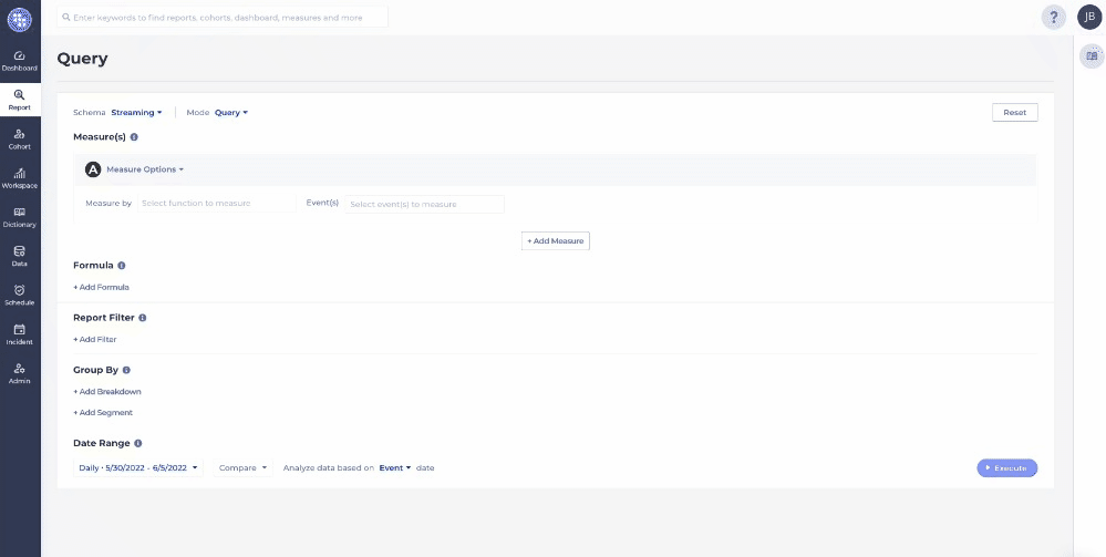
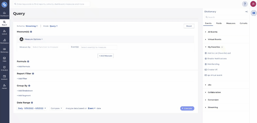
In the fast-paced world of data analytics, ease of use and efficiency can mean the difference between success and stagnation. Enter Kubit’s new drag and drop experience—a game-changer for analysts, product managers, and marketers alike.
Drag and drop interfaces have transformed the ease of performing self service analytics –just click, drag, and discover. This simplicity not only speeds up tasks but also makes analytics accessible to everyone, regardless of technical expertise. Kubit’s intuitive interface is designed to accelerate your workflow, providing quicker insights, greater efficiency, and a more enjoyable user experience.
The Vision Behind the Creation
Our team at Kubit observed that users were spending a lot of time building insights and trying to understand how to leverage events, filters, measures, and cohorts. To address this, we implemented a drag-and-drop interface to substantially reduce the learning curve. With this new feature, users can easily see where each entity can be utilized within the tool. Now, users can focus on what truly matters: analyzing data, drawing insights, and making informed decisions.
Advantages of Kubit’s Drag and Drop Experience
Kubit’s new drag and drop interface offers several key advantages for anyone involved in data analytics.
Reducing the Learning Curve
Over the past few months, our focus has centered on enhancing the user experience. We’ve introduced category tags, favorites, and most recently, drag-and-drop functionality. Category tags enable users to swiftly locate the data they need, streamlining access to specific datasets. Leveraging favorites allows users to easily tag events, measures, and cohorts as their favorites, ensuring quick and convenient access when employing drag-and-drop functionality. This simplicity allows new team members to quickly acclimate, while enabling existing members to concentrate on analysis and sharing insights.
Encouraging Continuous Learning and Improvement
Kubit’s drag and drop experience encourages continuous learning and improvement by making data analysis accessible to everyone. Users can experiment with different reports and analysis techniques, gaining new skills and insights along the way. This continuous learning fosters a culture of innovation and improvement, ensuring that the organization stays ahead of the curve.
Speeding to Insight
Creating reports can be a time-consuming process, especially when using traditional methods. Kubit’s new drag and drop interface allows users to create reports with just a few clicks. This not only saves time but also empowers users to focus on analyzing data and making informed decisions.
Conclusion
In today’s fast-paced business environment, the ability to quickly and accurately analyze data is crucial. Kubit’s new drag and drop experience offers a solution that is not only powerful but also incredibly user-friendly. By simplifying the report building process, increasing efficiency, and fostering collaboration, Kubit empowers analysts, product managers, and marketers to make data-driven decisions with ease.
Ready to see how Kubit can revolutionize your data analysis? Contact us now and start exploring the possibilities.
Also feel free to explore our help documentation for an indepth look at Kubit’s new drag and drop dictionary.
Executive Dashboards have been a key tool and resource for C-suite executives as long as data and analytics have been around, so a while. The evolution of dashboards has led to more in-depth and interactive tooling, however the core needs of an executive remains KPIs and metrics that allow them to quickly and effectively understand how the business is performing.
The core needs of speed and efficiency should be at the heart of how you create and manage an executive dashboard, but there are also several design principles that should be taken into account. With this post we will dive into the best practices when developing a dashboard for your executive team, focusing mainly on those executives who look at user behavior data.
What is an executive dashboard?
Fundamentally an executive dashboard is no different than any other dashboard your analytics or BI team creates for other functions of the business. It should consist of relevant and trusted insights that allow for fast decision making. Where they begin to differ is the substance and detail included in an executive dashboard vs. any other.
An executive needs to see KPIs first and foremost and in the simplest terms possible. This is not to diminish the complex calculations or various inputs of that KPI, more so it demonstrates how valuable these metrics are at communicating complex information. Designing the proper KPIs are another topic entirely but some common ones that should be included are expanded upon below.
Additionally these dashboards should be accessible to the executive whenever he or she needs to see them. This allows for self-service and reduces the speed between an executives question and the relevant information to answer or help answer it. When selecting a tool to deliver this information it’s important to consider ones that don’t require human intervention prior to sharing it.
Let’s look deeper into the type of information typically included in an executive dashboard, and a few you may want to consider.
What you should include on an executive dashboard
The question of what a dashboard should include entirely depends on what the Role and Goals of the executive are. Most often each team or line of business (LOB) have their own slice of data and dashboard that dive deep into these given areas. As mentioned above, executive dashboards need a summarized view of this complex world and are often composed of parts of these LOB dashboards.
A few best practices when designing these executive dashboards include:
Relevant Time Period
Consistent Naming
Critical Metrics Only
Context When Possible
If the executives typically look back and plan forward Quarterly then ensure the intervals of time align with that view point. It’s less useful if a report is Daily but the CMO plans Monthly.
Ensure that any common nomenclature or terminology is carried onto the Dashboard. Acronyms should also be defined to remove any possible confusion.
Include only the top KPIs and summarized metrics. If the dashboard contains too many details it can be difficult to know what’s a KPI vs. a subset of metrics.
Most often the numbers presented have a story behind them. It can be valuable to include a summary of this story or incident that may allude to the metric displayed. I.e. Data outage, large campaign, holidays.
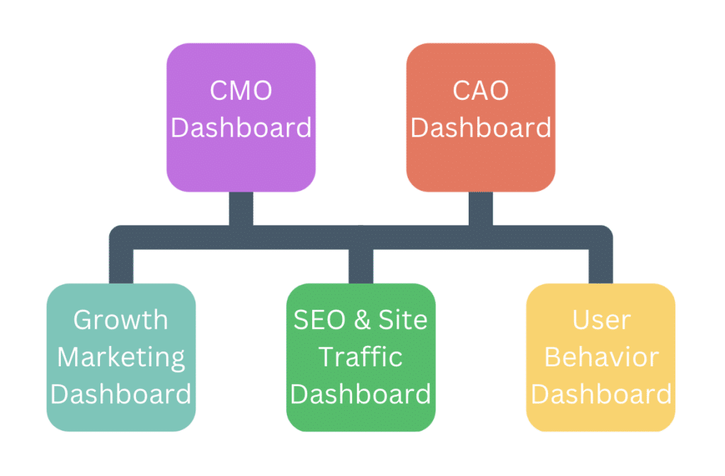
Let’s break down these best practices framed by a few executive roles Kubit sees leveraging executive dashboards. A good rule of thumb is to keep it short and simple, a dashboard with more than 7+ reports is difficult to navigate so you should challenge yourself to keep it under 7 charts.
CPO – Chief Product Officer
Across industries a Chief Product Officer (CPO) often needs to get a broad view of how users are adopting, growing and maturing through their product(s). This becomes especially important if your business has several products that promote one another. A few core KPIs we see with these types of executive dashboards include:
A summary of those users based on their current status or maturity
This typically includes a definition of New, Existing and Dormant users.
Seeing this breakdown will best illustrate what segment comprises your average user base.
Conversion Rate of a core flow i.e. Login or Purchase
This should be a flow that nearly all users are expected to do or denote value within your product.
Top KPIs defined by your product managers that ladder to specific areas of user engagement.
These are typically called “Input Metrics” and include things like:
Average Sessions per User
Average Engagement Events per User
% of Users Who performed X event(s)
Average Duration of Sessions
A North Star Metric that encompasses the successful value exchange between your product and the user.
A North Star Metric can be difficult to design but when done correctly it gives the best possible picture of how the product is performing.
Examples include:
Average Session Duration per Paying User
Average Checkout Value per Loyalty Member User
Average Minutes Watched per Paying User
Furthermore if you have several products your CPO is responsible for you can add another layer of Avg Products per User to understand if cross-sell or upsell strategies are working.
Also provide a filter control within the dashboard to allow the CPO to filter to a specific product or product line.
CMO – Chief Marketing Officer
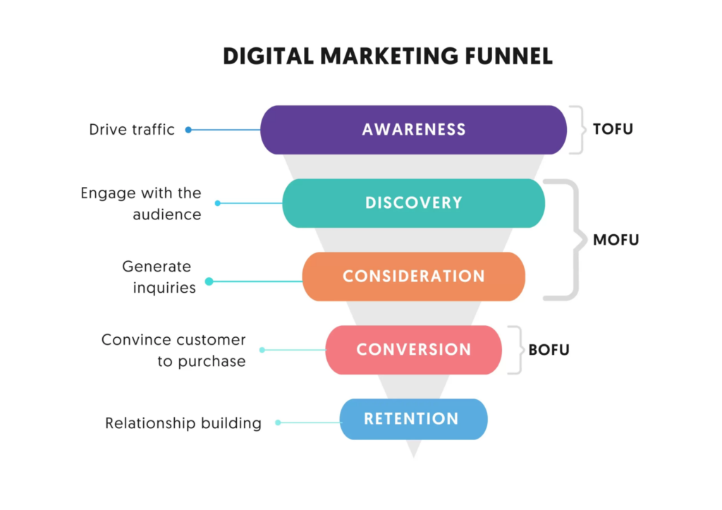
From our experience a majority of CMOs focus on two things:
How good are we at attracting new customers to our platform or service?
How good are we at attracting new customers to our platform or service?
How efficient are we at converting those new customers into paying or returning users?
Most often teams will have a good idea of #1 because Marketing data like impressions, clicks and click through are tracked using a single toolset or tagging infrastructure. We typically see this data generated by looks like Google Analytics, Braze, Iterable or the various other Marketing Acquisition Tools. These do a great job of collecting this data in a standardized way across platforms and products.
An added benefit of leveraging tools like GA is that you typically can see ad spend next to the impression and click through data so CMOs can quickly see ROI on their team’s efforts. ROI will be a critical KPI for most CMOs so taking steps to attempt to bring the ad spend data next to the user behavior (i.e. impressions and clicks) is something we recommend marketing teams investigate and attempt.
Inversely #2 is the most difficult data for CMOs to see as the outcomes of their efforts are left to be collected and analyzed by the CPO and the data no longer exists within their marketing toolset. Tools like Kubit will help connect the dots between these two datasets as both often live within the data warehouse and can be analyzed within Kubit.
A few core KPIs we see with CMO executive dashboards include:
User Acquisitions from various marketing channels like search, social media and email.
This metric refers to counting the number of users on your platform or site that were referred by your marketing channels.
High value Conversions via emails, ad and organic channels that you can tie to product growth.
Also referred to as Click Through Rates and you’ll divide the number of impressions by the number of clicks typically by marketing channel.
Primary SEO metrics if that’s a point of focus for your Marketing organization.
This includes domain rankings, backlinks, keywords, content spend etc.
Reputation signals from 3rd party reviews and testimonials.
Even better if you have a portal that can send this data into your data warehouse for easier analysis.
Often though this data comes in spreadsheets and not connected to a specific user, if the data is challenging to fit into a data model best to leave it out of the dashboard and share ad-hoc.
Presence on social media page likes and follows to ensure your audience is growing and engaged.
These numbers are also often retrieved from 3rd parties or you can purchase a social media monitoring system and collate data across social networks for easier reporting.
Product and site traffic, conversion and engagement metrics from your acquisition audience.
This piece is critical to understand if the gains seen in the top of the funnel translate to long term users and revenue.
Why are executive dashboards important?
Executives are busy and have dozens of workstreams, initiatives and goals they are tracking at any given time. The best lifeline and resource they can have is reliable and well organized data to aid in their decision making. Executive dashboards provide this information and should be a centerpiece of any executive’s regular tasks, which means they are probably one of the most important things to any c-suite.
What happens when this information isn’t readily available? In short, gut instinct and intuition take a front seat in most decision making. While those two things are incredibly valuable attributes of an executive it doesn’t mean they are seeing the entire picture which leads to blindspots and missed opportunities. Executives are asked to make big sweeping decisions that could impact people, process and technologies across portions of an organization so asking “What are executive dashboards important?” is frankly a silly question… even though I just asked it!
In short, they are incredibly important and to summarize why:
Improves decision making
Reduces speed to insights
Provides transparency across the organization
Improves communication between cross-functional teams
How to use Kubit to build an executive dashboard
Kubit has several features that enable valuable executive dashboards and with our warehouse-native architecture bringing data from various sources together is made easier. In traditional tools that let you analyze user behavioral data you’re often limited by what that tool collects or the format of data it expects. Because Kubit has a “bring your own data” model we can mold to your unique data structure.
A few core features of Kubit specific to executive dashboards include:
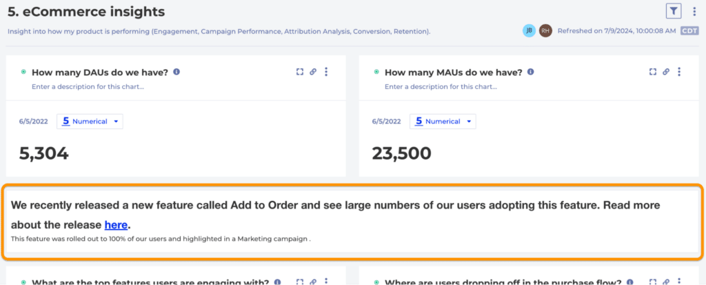
Rich Text in Dashboards
Add rich text to dashboards which allow you to infuse story, context and resource hyperlinks alongside the data.
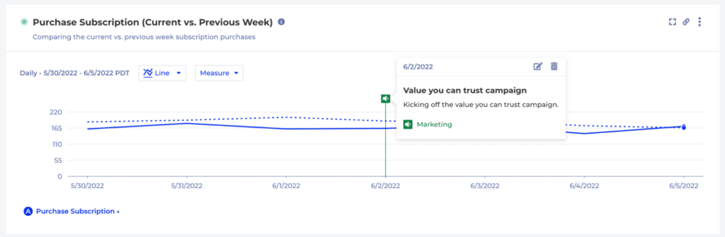
Incidents in Kubit
Create Incidents in Kubit to highlight critical releases, outages, campaigns or holidays that would impact KPIs. This means executives can toggle this information on and quickly get context without reaching out for more information.
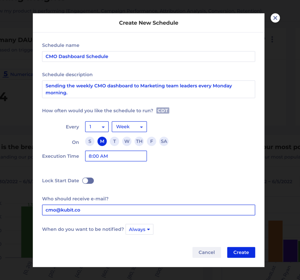
Dashboard Schedules
Schedule dashboard refreshes and send emails regularly to automate the distribution of this information via Kubit’s UI.
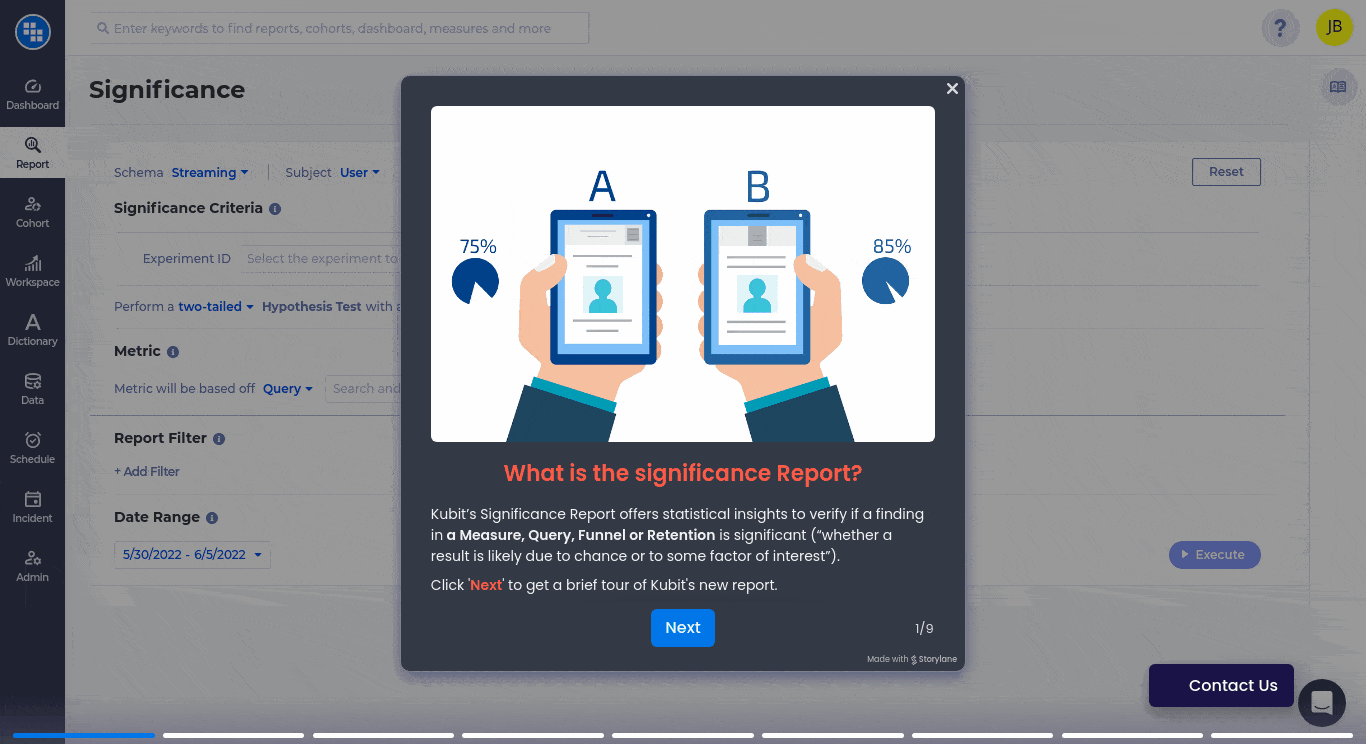
In the fast-paced realm of data analytics, staying ahead requires continuous evolution. Kubit is excited to unveil our new Significance Analysis Report, designed to effortlessly integrate and analyze behavioral, marketing, and operational data alongside your experimentation insights. Tailored for data enthusiasts and decision-makers alike, this report promises to redefine how you interpret and leverage your data. Understanding the statistical impact has never been easier. Join us in this blog post as we explore the rationale behind building this new report, its potential benefits for various stakeholders, and the diverse range of analyses it enables. Are you prepared to elevate your data-driven insights?
The Genesis of Our Significance Analysis Report
Why Did We Build This?
The demand for accurate data insights is more critical than ever. Analysts and decision-makers often face challenges managing data from various sources, leading to complexity and inefficiencies. Many customers struggle to integrate and analyze experimentation data alongside product, marketing, and operational data, often pulling from over multiple different tools.
At Kubit, we recognized these challenges and saw an opportunity to extend our capabilities. As a warehouse-native platform, we can effortlessly read data from the warehouse, making AB testing analysis seamless. Our solution, the Significance Analysis Report, simplifies statistical analysis, enhances accuracy, and empowers confident, data-driven decisions.
Who Stands to Benefit?
Experimentation Teams
For those involved in A/B testing and experimentation, the Significance Analysis Report is a game-changer. It offers clear, actionable insights into experiments, revealing metrics like lift, confidence level intervals, standard deviation, and test scores. This tool empowers you to understand what strategies work best, enabling faster iteration and more effective optimization of your approaches.
Data Analysts and Scientists
Data professionals will value this because you can use this even though you don’t have experimentation data. Hold on—are you saying this new report can be used without having pre-defined experiments? Absolutely! We’ve included additional options for data professionals to compare breakdowns or different cohorts/segments of users, simulating the same analytical power as experiments.
Decision Makers
For executives and other decision-makers, this report provides a clear, concise summary of key metrics. It turns complex data into understandable insights, making it easier to make informed decisions quickly. No more sifting through endless reports or comparing multiple charts—get the information you need at a glance.
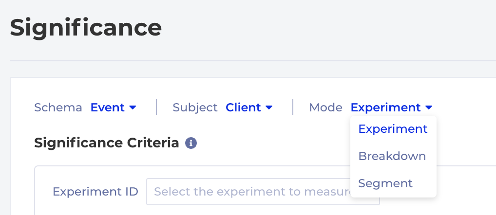
Exploring Different Types of Analysis
Experiment Mode:
Available exclusively for customers with:
Experiment ID or Name
AND a Variant ID or Name
For teams focused on experimentation, this mode allows you to analyze your experiment data directly. Select your Experiment ID and related Variants to pinpoint specific audience segments. Kubit seamlessly maps these fields based on your data, providing clear insights once enabled.
Breakdown Mode
When analyzing metrics impact without specific experiment data, you can still measure lift across various dataset values such as User Type, Platform, Subscription Type, and Country. Customize your report by breaking down data values, with the option to add more Variants for detailed analysis.
Segment Mode
Segment users based on their presence in pre-saved Cohorts, enhancing the analysis similar to Breakdown Mode. Begin by creating and saving Cohorts for comparison purposes, streamlining your segmentation analysis within Significance.
Please refer to our help documentation for detailed information on the various analysis types available with Significance Analysis.
Data-driven decision-making continues to become crucial for companies of all sizes. Whether you are a startup or a Fortune 500 company, understanding your users’ behavior has never been more important.
In this pursuit of growth, companies turn to product analytics to collect and analyze the information that will help them provide a better digital experience, and win over new users. The only problem with this is traditional product analytics can be labor-intensive and time-consuming.
Luckily, there are new developments in the product analytics space with regard to the collection and analysis of user data. Companies now have the option to skip the SDK or ETL integration with no-code solutions that allow product analytics to connect directly with their cloud data warehouse, creating one single source of truth.
Kubit And The Future Of Self-Service Product Analytics
Below are some ways that Kubit is helping Product Analytics move towards a Self-Service future.
Era Of Analytics Is On-Demand:
Organizations are increasingly relying on getting the insights they need when they need them. This makes for real-time decision-making and a more dynamic approach to problem-solving. But, traditional Product Analytics has not allowed for this real-time decision-making to happen.
Kubit solves this problem with their real-time user dashboard and dynamic cohorting. With Kubit, your team can get the insights they need without having to wait for a team of analysts to find it for them. To learn more about how easy it can be to get instant Product Analytics insights,click here.
The need for team-driven analysis:
Collaboration is key when an Organization is trying to get the most out of their product Analytics. But, this collaboration can be difficult when non-technical team members don’t have the tools they need to find and share the insights that they are looking for.
Kubit helps to solve this problem by providing a team-driven platform. The best analytics decisions are made by groups that work from One Single Source of Truth. Kubit’s platform fosters team cohesion, efficient communication, and data-driven cultures with a simple but elegant platform.
Bottom Line:
Whether you’re a Product Manager at an early-stage startup or a Marketing Analyst at a Fortune 500 company, you know that good data is critical for making vital business decisions.
Today, the biggest names in the consumer enterprise space are betting on Kubit’s self-service analytics platform to close this gap and give their employees greater insight into how their products and user behaviors are performing.
This website uses cookies to ensure you get the best experience on our website. Learn More