AI Reimagined: Analytics Intelligence – A Prerequisite for Artificial Intelligence

When people hear AI, they often think of artificial intelligence—a powerful technology transforming industries. But at Kubit, we view AI differently. For us, it stands for Analytics Intelligence, an approach that prioritizes data transparency over the complexities artificial intelligence can create when applied to misunderstood data.

Artificial Intelligence and Misunderstood Data: Adding to the Confusion

While artificial intelligence has immense potential, applying it to poorly understood or siloed data often worsens confusion. It’s similar to automating a flawed process—you’re simply accelerating the problem. When AI is layered on top of this kind of data, the results are typically conflicting insights, incomplete answers, and poor decision-making.

A 2023 report by Forrester found that 60% of decision-makers struggle to trust the data output from AI-driven systems. This is largely due to black-box AI systems, which offer no visibility into how data is processed. Business leaders are often left in the dark about how insights are generated, which breaks down trust and leads to inefficiencies. Moreover, relying on AI to run complex queries without understanding the data sources can be extremely expensive. 

The solution? Embrace Analytics Intelligence and lean into data transparency.

Kubit’s Approach to Transparency: Analytics Intelligence in Action

At Kubit, we believe in empowering businesses with full visibility into their data, enabling them to understand and trust the information driving their decisions. Here’s how we make that happen:

1. Open Data Sources and Streamlined Systems

Traditional product analytics solutions, like Amplitude, operate within a black box, leaving users in the dark about how insights are generated. Kubit takes the opposite approach: we open up data sources so users can see exactly where their data comes from and how it’s processed. This transparency eliminates confusion and reduces errors caused by disconnected or misaligned systems.

2. SQL Visibility After Reports Are Built

A common frustration with AI-driven data solutions is the inability to understand how reports are created. At Kubit, we provide full SQL visibility after reports are built. Users can see the exact queries behind every report, giving them full transparency into the logic and calculations used.

This level of insight helps users:


    • Identify errors or inconsistencies in reports

    • Troubleshoot issues when data seems off

    • Refine reports and queries as needed, without guesswork

SQL Visibility After Reports Are Built

3. Self-Service Access to Data

Traditional AI systems often centralize data access, making business users reliant on data teams to pull reports or run queries. Kubit changes this dynamic by offering a self-service model, allowing users to access data independently, without needing a data team to mediate.

Benefits of self-service data include:


    • Faster decision-making

    • Less dependency on technical teams

    • Increased agility across departments

4. Removing Data Silos by Keeping All Data in the Warehouse

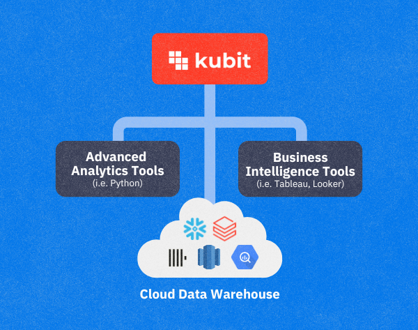
Data silos—isolated pockets of information stored in different systems—can cause discrepancies and confusion. Many AI systems only layer additional complexity on top of this fragmented data. Kubit solves this problem by keeping all data in the data warehouse, ensuring everyone operates from a single source of truth. This eliminates silos and allows teams to collaborate using consistent, reliable data.

Removing Data Silos by Keeping All Data in the Warehouse

A Future Built on Analytics Intelligence

As businesses grapple with increasing data complexity, relying solely on AI-driven black-box solutions can be risky. The better approach is Analytics Intelligence, which emphasizes transparency and accessibility.

Kubit’s focus on open data sources, SQL visibility, and self-service data access empowers companies to make smarter decisions, faster—without the confusion and inefficiencies artificial intelligence can sometimes create. By keeping all data in the warehouse, we ensure there are no silos, only clear, actionable insights that drive business success.

Discover Kubit

Activate your warehouse data with complete analytics.

A Focused Approach: Why Being Best-in-Class Beats All-in-One

With recent shifts in the product analytics landscape, Kubit stands apart as the only warehouse-native solution that remains independent of any specific use case or integration partner. While some competitors are being acquired by larger platforms and shifting their focus to MarTech, Kubit continues to focus on delivering clear, accurate data insights directly from the customer’s cloud data warehouse. Instead of getting distracted by expanding into other fields, Kubit stays committed to its core mission: providing data transparency and control to help businesses democratize analytics and make smarter, faster decisions.

Why Focusing on a Data Visibility Solution Matters

The traditional method of moving data into third-party data silos and analytics tools (via ETL processes or SDK) has several drawbacks, and Kubit’s focused approach directly addresses these issues:


    • Scaling and resource constraints: As data requests increase, traditional platforms struggle to scale efficiently, often leaving teams waiting for insights.

    • Errors and confidence: Moving data to third-party tools introduces risks of inaccuracies, diminishing trust in the analytics provided.

    • Inefficiencies: Teams often waste time fixing issues introduced by complex integration processes.

    • Security concerns: Transferring sensitive data to external systems adds potential security vulnerabilities.

Kubit solves these problems by keeping everything within the customer’s chosen data warehouse. Our platform integrates directly with the source, avoiding the need to move data into multiple systems. This focus on data visibility, without unnecessary complexity, ensures that our users can trust their data—every time.

Speed and Agility

Large, one-size-fits-all platforms often suffer from long development cycles due to their complex roadmaps, which try to satisfy various customer needs across different industries. At Kubit, our focus allows us to be agile and responsive to customer requests. Rather than waiting years for features that are deprioritized in favor of more generalized tools, Kubit delivers quick, impactful updates that directly address the challenges facing data organizations today.


    • Faster implementation: Our platform has seamless No-Code integration, allowing customers to gain insights within 10 days.

    • Continuous innovation: We rapidly introduce new features weekly based on customer feedback, maintaining a competitive edge.

Staying Warehouse Independent

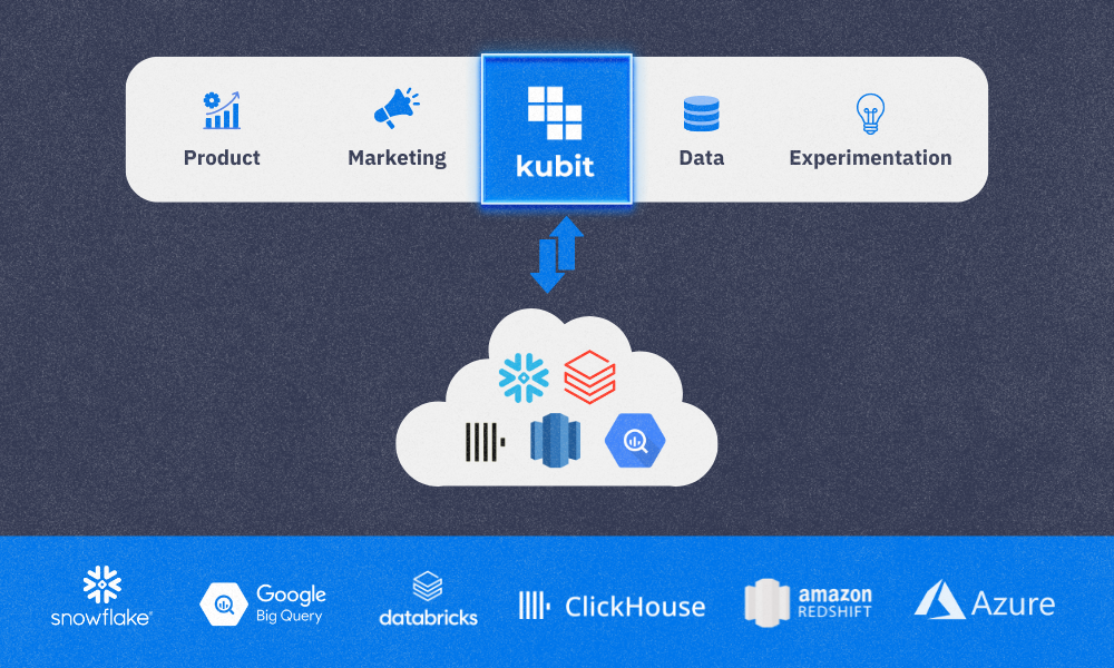
One of Kubit’s greatest strengths is our warehouse independence. While we partner with all major data platforms like Snowflake, BigQuery, Databricks, Redshift and ClickHouse, we remain agnostic, ensuring customers are not locked into any single ecosystem. This flexibility allows data teams to use the infrastructure that best suits their needs, without sacrificing performance or control.

Kubit Partner Data Warehouse Graphic

By remaining warehouse-independent, Kubit enables customers to keep control of their data infrastructure while maximizing the value of their analytics.

Why Best-in-Class Beats All-in-One

All-in-one platforms often promise the world, but their focus is spread too thin. The favoritism of one specific set of data over another completely misses the point of data insights from a central warehouse. This skew in focus results in bloated systems full of features that most users don’t need. In contrast, Kubit’s best-in-class approach is laser-focused on solving real problems for data teams. Whether it’s providing product analytics, executive dashboards, or improving decision-making through data democratization, our mission is clear. Kubit is focused on being the best at what we do, providing superior data visibility and analytics solutions to every team throughout an organization.

Conclusion: Simplicity Drives Success

As the data analytics industry continues to evolve, it’s clear that simplicity and specialization are the keys to success. Kubit’s warehouse-native approach empowers data teams to maintain control of their data without the overhead or complexity of large, all-in-one platforms. By staying focused on data transparency and flexibility, Kubit delivers faster, more reliable insights, helping businesses make better decisions.

Recent events only validate our approach, and we’re excited to continue leading the charge in warehouse-native analytics, putting data visibility and customer needs at the forefront.

9 Amplitude Alternatives by Use Case

Ready to move on from Amplitude, or want to explore other options? Read this blog post to get a better understanding of vendors that offer similar solutions to Amplitude, their target use cases, key features, and customer ratings. 

#CompanyG2 scoreDescription
1Kubit4.6Warehouse-native product analytics for optimizing digital products while ensuring data security, compliance, and scalability
2Mixpanel4.6Product analytics for understanding customer behavior across devices to improve user experience
3Heap4.4Digital insights for improving the customer journey and testing new features and experiences
4Pendo4.4Product experience platform that helps teams deliver better software experiences and increase product adoption 
5Netspring4.3Analytics for insight on digital product usage, customer journey, and business intelligence

What is Amplitude?

Amplitude is a product analytics platform that helps businesses build better digital products by tracking and understanding user behavior. Amplitude analytics help teams answer questions about what happened and why. These insights enable informed decision-making to drive growth.

Businesses use Amplitude to:

  • Analyze active users
  • Understand customer value
  • Accelerate monetization
  • Increase user engagement and retention 
  • Improve the customer journey
  • Maximize user adoption 

Drawbacks to using Amplitude

Choosing the right analytics platform for your use case is critical for success. Many analytics vendors are on the market, and each has its own strengths (and drawbacks), depending on the use case it’s implemented for. Some drawbacks to using Amplitude include:

It’s not warehouse-native. With Amplitude, you must move or replicate your data for analysis, so your data will not represent a 100% complete, up-to-date picture.

Higher cost of ownership. Amplitude requires additional engineering resources to transform data into a certain format, include historical data, expunge data, or add new schemas to it.

Limited permissions. While other product analytics vendors offer custom, role-based permissions, Amplitude offers only four out-of-the-box roles.

Data security. With Amplitude, your data must leave the walls of your CDW to be analyzed, potentially causing security or compliance risks. 

Data analysis. Amplitude offers common analysis types but does not include capabilities such as and/or with filters, creating filters on the fly, out-of-the-box sampling, access to SQL behind each query, or creating histograms on the fly.  

Top 9 alternatives to Amplitude, by use case

#1 Kubit

Use case: Warehouse-native analytics for optimizing digital products while ensuring data security, compliance, and scalability.

Kubit analytics platform helps companies gain valuable customer insights without moving their data into silos. This warehouse-native approach lowers the cost of ownership, frees up engineering resources, and delivers more accurate and complete self-service insights.

Key features:

  • User engagement: Find out which user behaviors lead to higher lifetime value and how to retain and grow your user base.
  • Feature engagement: See which product bets drive the highest engagement and create power users within your product.
  • Conversion analysis: Learn how users convert through critical funnels within your product and how to resolve areas that lead to drop off.
  • Consumption patterns: Understand which product bets and content to play up and which to sunset.

G2 gives Kubit 4.6/5 stars. Read reviews of Kubit on G2.

#2 Mixpanel

Use case: Analytics for learning how and why people engage, convert, and retain (across devices) to improve their user experience.

Mixpanel is a digital analytics platform that helps companies measure what matters, make decisions fast, and build better products through data with self-serve product analytics solutions.

Key features: 

  • Product analytics: Track user behavior, KPIs, and core metrics with trends, retention, and flows.
  • Collaborative boards: Build analysis in collaborative boards that can include reports, text, videos, and GIFs.
  • Alerts: Get automated notifications when there are anomalies in metrics or when they fall outside of an expected range.
  • Filtered data views: Hide and filter data on a per-team basis to protect data privacy and reduce noise.

G2 gives Mixpanel 4.6/5 stars. Read reviews of Mixpanel on G2.

#3 Heap

Use case: Analytics for improving the customer journey and testing new features and experiences.

Heap is a digital insights platform that helps companies understand their customers’ digital journeys so they can quickly improve conversion, retention, and customer delight.

Key features:

  • Session replay: Get insights about user behavior by replaying their session to understand where they experience friction.
  • Heatmaps: A visualization of a user’s behavior on the page, including what they click on, how far they scroll, and where they focus their cursor.
  • Autocapture: Capture all the data you need automatically, including every view, click, swipe, and form fill, for web and mobile.
  • Segments: Create user cohorts based on real actions taken on your site or app to understand how different users navigate your digital experience.

G2 gives Heap 4.4/5 stars. Read reviews of Heap on G2.

#4 Pendo

Use case: Product analytics, in-app guides, session replay, and user feedback.

Pendo is a product experience platform that helps teams deliver better software experiences and increase product adoption through onboarding users, tracking adoption analytics, monitoring usage patterns, and measuring churn rates.

Key features:

  • Product analytics: Collect app and user data and learn from the past to make informed decisions that improve product adoption.
  • Session replay: Watch video playbacks of user sessions to understand why users do what they do.
  • In-app guides: Deliver personalized guidance to customers directly inside your app.
  • Product-led growth: Drive better customer retention, conversions, and engagement with less time and expertise.

G2 gives Pendo 4.4/5 stars. Read reviews of Pendo on G2.

#5 Userpilot

Use case: Analytics for increasing product adoption, improving onboarding, and supporting product-led growth.

Userpilot is an all-in-one platform for Product & UX teams. It combines product analytics, in-app engagement, and in-app surveys to help you increase product adoption through powerful in-app experiences, actionable product analytics, and user feedback. 

Key features:

  • Feature tags and heatmaps: Tag certain UI elements and monitor how users interact with them; visualize data through color-coded heatmaps.
  • Custom event tracking: Track relevant milestones in a customer journey that reflect desirable user behavior, like downloading a Chrome extension, and then monitor how many users behave in that manner.
  • Analytics dashboards: Track product usage metrics such as the number of active users, sessions, average session duration, and feature adoption rate from a single view.
  • Funnel analysis: Track how users progress through different user funnels, enabling you to discover friction points in the user journey and optimize them to improve the user experience.

G2 gives Userpilot 4.6/5 stars. Read reviews of Userpilot on G2.

#6 Smartlook

Use case: Analytics for websites, iOS/Android apps, and various frameworks that answer the “why” behind user actions.

Smartlook gathers brands’ app data together on one central dashboard to provide clear, data-driven decision-making for product managers, marketers, UX designers, and developers to reduce churn rates, boost conversions, identify and fix bugs, and improve UX.

Key features:

  • Session recordings: Evaluating user recordings can reveal issues with your app or website.
  • Events: Find out how often users perform certain actions that are important to you.
  • Funnels: Find out where and why your users are dropping off, so you can improve. 
  • Heatmaps: Get an overview of where your users click and how far they scroll.

G2 gives Smartlook 4.6/5.0 stars. Read reviews of Smartlook on G2.

#7 Google Analytics

Use case: Freemium analytics service for gaining insight into website and app behavior, user experience, and marketing efforts.

Google Analytics collects website and app visitor data to help businesses determine top sources of user traffic, gauge the success of their marketing campaigns, track goal completion, discover patterns and trends in user engagement, and obtain visitor demographics.

Key features:

  • Built-in automation: Get fast answers to questions about your Google Analytics data, predict user behavior, and tap into powerful modeling capabilities.
  • Reporting: Dive deeper into the ways customers interact with your sites and apps with real-time reporting, acquisition reports, engagement reports, and monetization reports.
  • Advertising workspace: Understand the ROI of your media spend across all channels to make informed decisions about budget allocation and evaluate attribution models.
  • Explorations: Run deeper, custom analysis of your data without the limitations of pre-defined reports, and share insights with other users.

G2 gives Google Analytics 4.5/5 stars. Read reviews of Google Analytics on G2.

#8 Netspring

Use case: Analytics for insight on digital product usage, customer journey, and business intelligence.

Netspring is a product and customer analytics platform that brings the modeling flexibility and exploratory power of business intelligence to self-service product analytics, working directly off of any cloud data warehouse.

Key features:

  • Self-service: Self-serve answers questions from a rich library of product analytics reports, with the ability to pivot back and forth between any report and ad hoc visual data exploration.
  • Warehouse-native: Combine product instrumentation with any business data in your data warehouse for context-rich analysis.
  • SQL option: Avoid writing and maintaining complex SQL for funnel/path-type queries, but have the option of leveraging SQL for specialized analysis.
  • Product and customer analytics: Solutions for behavioral analytics, marketing analytics, operational analytics, customer 360, product 360, and SaaS PLG.

G2 gives Netspring 4.3/5 stars. Read reviews of Netspring on G2.

#9 Posthog

Use case: Combining product analytics, session replay, feature flags, A/B testing, and user surveys into an all-in-one, open-source platform.

Posthog enables software teams to capture events, perform analytics, record user sessions, conduct experiments, and deploy new features, all in one platform, helping engineers to design better, build better, develop better, and scale better.

Key features:

  • Product analytics: Funnels, user paths, retention analysis, custom trends, and dynamic user cohorts. Also supports SQL insights for power users.
  • A/B tests: Up to nine test variations, as well as primary and secondary metrics, can be used. Test duration, sample size, and statistical significance can be automatically calculated.
  • Session replays: Includes timelines, console logs, network activity, and 90-day data retention.
  • Surveys: Target surveys by event or person properties. Templates for net promoter score, product-market fit surveys, and more.

G2 gives Posthog 4.4/5 stars. Read reviews of Posthog on G2.

Is Kubit right for you?

Customers typically choose Kubit product analytics over Amplitude for four reasons: 

  • Warehouse-native architecture
  • Lower total cost of ownership
  • Data security and compliance
  • Expansive analysis capabilities


If you’re ready to empower your teams with warehouse-native, self-service product analytics, without having to move your data, contact us.

Key product analytics metrics

What are product analytics metrics and why are they important

In the digital age, data is the lifeblood of any business. It can transform a company’s trajectory, inform strategic decisions, and predict customer behavior. But data alone isn’t enough. It’s the application of relevant metrics that can truly drive business growth. When created and measured appropriately, metrics can help illuminate the path to better customer experiences, optimized products, and business success. However, not all metrics are created equal. The key lies in selecting ones that are meaningful, actionable, and tied to your specific business objectives.

In this blog post, we dive into the importance of metrics in product analytics, how to set the right ones, and when to measure and evolve them.

Understanding Quality Metrics

Quality metrics provide actionable insights that are specific to your business. They’re quantifiable, easy to understand, and directly linked to your key performance indicators (KPIs).

For instance, an essential metric is Viewing Time in seconds if you’re a streaming media business like ViX. That heartbeat metric is directly tied to the business goals of driving more watch time and directly impacts revenue. Please check out this case study for a more detailed overview of how ViX teams use Kubit to support and enhance their daily work.

Setting Quality Metrics

Identifying the right metrics is vital for your product’s success. Here are some common categories of metrics to consider:

Acquisition

Acquisition metrics are crucial in understanding how effectively you’re attracting new users. By capturing and utilizing these metrics, you gain valuable insights that fuel informed decisions about your product’s growth strategy.

Acquisition metrics track the process of bringing new users into your ecosystem. This includes aspects like website visits, app downloads, sign-ups, and user acquisition cost (UAC) across different marketing channels. Analyzing these metrics helps you identify which channels are most successful in attracting your target audience. Imagine you see a surge in sign-ups from social media ads compared to email marketing. This tells you to invest more resources in social media campaigns.

Furthermore, acquisition metrics help you optimize your marketing spend. You can identify areas where you get the most bang for your buck by tracking UAC per channel. This allows you to allocate your budget more efficiently towards channels that deliver high-quality users.

Overall, capturing and utilizing acquisition metrics is essential for any product team aiming to grow its user base. They provide a data-driven perspective on your marketing efforts, ultimately leading to a more targeted and successful product strategy.

Activation

Once you’ve acquired a new user, you must focus on how best to activate them and turn them into engaged users. Capturing and utilizing activation data is critical for optimizing your product and maximizing its long-term value.

Activation metrics focus on that critical “aha!” moment when users discover the core value proposition of your product. This might involve completing a specific action, like purchasing in an e-commerce app or creating a first post on a social media platform. Tracking activation rates (percentage of users who reach this point) and time to activation reveals valuable insights.

For example, a low activation rate could indicate a confusing onboarding process or a lack of a clear value proposition. By analyzing user behavior leading up to activation, you can identify friction points and streamline the user journey. Additionally, a long time to activate might suggest the need for in-app tutorials or targeted prompts to nudge users toward the core functionality.

Ultimately, utilizing activation metrics allows you to personalize the user experience and remove roadblocks that hinder engagement. By focusing on activation, you ensure those who acquire your product become invested users, driving long-term success.

Engagement

Engagement metrics are the lifeblood of understanding how users interact with your product. This data is paramount for fostering a sticky and successful product and goes beyond simply acquiring users; they delve into how deeply users interact and derive value from your product.

Examples include daily/monthly active users, session duration, feature usage frequency, and content consumption. By analyzing trends in these metrics, you can identify areas that spark user interest and those that lead to drop-off.

For instance, a consistent decline in daily active users might indicate waning interest. If you investigate further, you might discover a new competitor offering a similar feature or a recent update that introduced bugs or a confusing interface. Conversely, a surge in a specific feature’s usage could signal a hit with users. This valuable insight allows you to double down on success and prioritize improvements in areas causing disengagement.

Ultimately, utilizing engagement metrics empowers you to refine your product roadmap. You can prioritize features that drive deep user engagement, fostering a loyal user base that consistently returns. This translates to increased product adoption and opens doors for monetization and long-term product viability. By focusing on engagement, you ensure your product isn’t just acquired but actively used and loved by your target audience.

Conversion

In the realm of product analytics, conversion metrics are the champions of measuring success. Capturing and utilizing this data allows you to understand how effectively you’re guiding users towards achieving your desired goals within the product. These goals can vary depending on your product type – a purchase on an e-commerce platform, completing a level in a game, or subscribing to a premium service.

Conversion metrics track the user journey towards specific actions. Common examples include click-through rates on calls to action (CTAs), add-to-cart rates, sign-up completion rates, and conversion funnel analysis. By analyzing these metrics, you gain valuable insights into how well your product is facilitating the desired user behavior.

Imagine a low conversion rate for your premium service sign-up. This could indicate a confusing pricing structure, an unclear value proposition, or a poorly designed sign-up process. Utilizing conversion metrics lets you identify these bottlenecks and optimize the user journey. A/B testing different CTAs or simplifying the sign-up flow can significantly improve conversion rates.

Ultimately, capturing and utilizing conversion metrics empowers you to maximize the value users derive from your product. By optimizing conversion funnels, you ensure users complete desired actions, leading to increased revenue, higher user satisfaction with achieving their goals, and, ultimately, a successful business.

Impact

In the fast-paced world of product development, every decision counts. Capturing and utilizing feature impact metrics is a critical tool in helping you understand how individual features influence user behavior and overall product success.

These metrics go beyond simple feature usage. They delve deeper, measuring the impact a specific feature has on key performance indicators (KPIs) like engagement, conversion rates, or even user satisfaction. This allows you to identify features that are driving positive outcomes and those that might be hindering progress.

For example, imagine you introduce a new social sharing feature in your productivity app. While user adoption might be high (many users try it out), the feature impact metric could reveal a negligible improvement in overall user engagement. This valuable insight suggests the feature might not be addressing a core user need.

By capturing and utilizing feature impact metrics, you gain a clear picture of how each aspect of your product contributes to the bigger picture. This data empowers you to make data-driven decisions, prioritize features that deliver real value, and ultimately build a product that resonates deeply with your users.

Retention

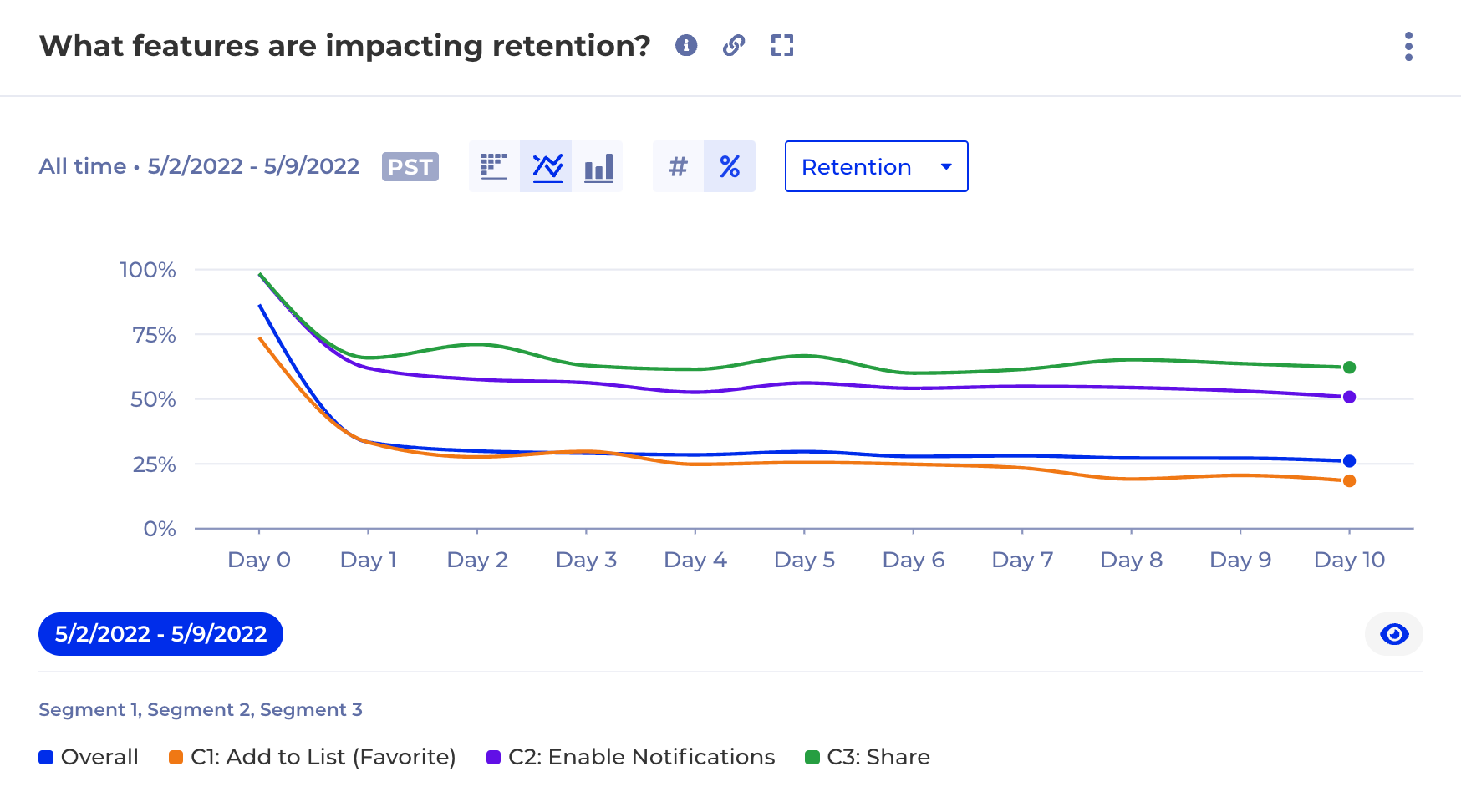
After going through the hard work of acquiring and activating new users, retention is the key to measuring long-term success. Capturing and utilizing retention data is paramount for building a product with lasting value and a loyal user base.

Common retention metrics include daily/monthly active users (DAU/MAU), and user lifetime value (LTV). By analyzing trends in these metrics, you gain valuable insights into user satisfaction and the “stickiness” of your product.

Imagine a steady decline in DAU or a high churn rate. This could indicate features that lose their appeal over time, a confusing user interface, or a lack of ongoing value proposition. Utilizing retention metrics allows you to identify these pain points and take action. This might involve introducing new features that drive continued engagement, simplifying the user experience, or implementing onboarding programs that foster deeper user understanding.

Ultimately, capturing and utilizing retention metrics empowers you to build a product that users love. By optimizing for user retention, you foster a loyal user base that consistently returns, leading to increased revenue, and improved brand reputation.. Retention metrics are the compass that guides you toward building a product with lasting appeal and a sustainable future.

Churn

Having an early warning system in the form of churn metrics is critical in mitigating potential issues. By effectively capturing and utilizing churn data, you gain invaluable insights into why users abandon your product, allowing you to identify and address issues before they become widespread.

Churn metrics track the rate at which users stop using your product over a specific period. This seemingly simple metric reveals a wealth of information. Analyzing churn rates across different user segments, timeframes, and acquisition channels allows you to pinpoint areas where users are most likely to churn.

Imagine a high churn rate amongst users who signed up through a specific marketing campaign. This could indicate misleading advertising that didn’t accurately represent the product’s value proposition. Conversely, a surge in churn shortly after a major update might point to usability issues or a confusing new interface.

By capturing and utilizing churn metrics, you gain a proactive approach to user retention. This data empowers you to identify and address issues that lead users to churn, ultimately fostering a loyal user base and building a product with lasting appeal.

Choosing the right metrics depends on your business type, product, and specific goals. There’s no one-size-fits-all approach, but keeping these categories in mind will guide you toward meaningful metrics that reflect your product’s performance and user behavior.

Measuring and Evolving Metrics

Once you’ve identified the right metrics, the next step is to measure them regularly to understand the baselines and make informed decisions. The frequency of measurement depends on the specific metric and your business needs.

For instance, DAUs (Daily Active Users) might be measured daily, while churn rate or retention might be measured monthly or quarterly. Reviewing and updating your metrics periodically ensures they remain relevant as your product and market evolve.

Also, remember that metrics should be seen as tools for learning and improvement, not just reporting. If a metric is consistently underperforming, use it as an opportunity to investigate, learn, and iterate on your product.

Metrics with Kubit

Kubit stands out in the crowded data analytics space due to its unique ability to seamlessly handle a comprehensive spectrum of data types, including but not limited to online, offline, transactional, operational, and behavioral data. Our warehouse-native approach ensures that organizations have the ability to access, analyze, and assimilate ALL of their data with Zero-ETL. This sets a new standard for creating, measuring, and adjusting metrics, offering unparalleled flexibility and precision. Unlike other solutions that mandate predefined data models in their data silos or limit the scope you can view, Kubit’s platform empowers you to explore every facet of your data and gain deep, actionable insights. This differentiation unlocks improved data-driven decision-making and gives you a competitive edge in today’s data-centric business environment.

Conclusion

Meaningful metrics are the guiding compass in navigating the expansive realm of product analytics. They provide a clear direction, enable informed decisions, and drive business success. By understanding what good metrics look like, how to set them, and when to evolve them, product managers and data analysts can increase their positive impact on business outcomes.

Remember, numbers tell a story. Ensure your metrics tell a story that matters to your business. Happy analyzing!

Explore your data with Multi-Dimensional Data Tables

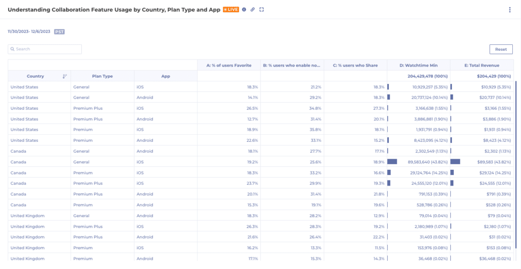
When analyzing data, analysts often need to compare various measures simultaneously and break them down by different properties and segments. Introducing Kubit’s latest analysis chart, Data Tables, which allows for multi-measure, multi-dimensional analysis in a single view.

Tools like Excel and Sheets have provided this type of data visualization and it works! While you may still want to see data in funnels, lines, bars and pie graphs; it can sometimes be best to see it laid out in a table view.
Our Customers are using Data Tables to understand things like:

  1. Cross Tab Analysis
    • How are User engagement metrics across different user segments and features?
  2. Custom Measures and KPI Analysis
    • Compare custom-defined measures or KPIs across different dimensions
  3. Segmented A/B Testing
    • Analyze user segments by control vs. variant groups
  4. Impact of Marketing Campaigns
    • Show click through rate, conversion rate by user segments and Campaigns all in one report

Getting Started with Data Tables:

  1. Navigate to Report → Data Table.
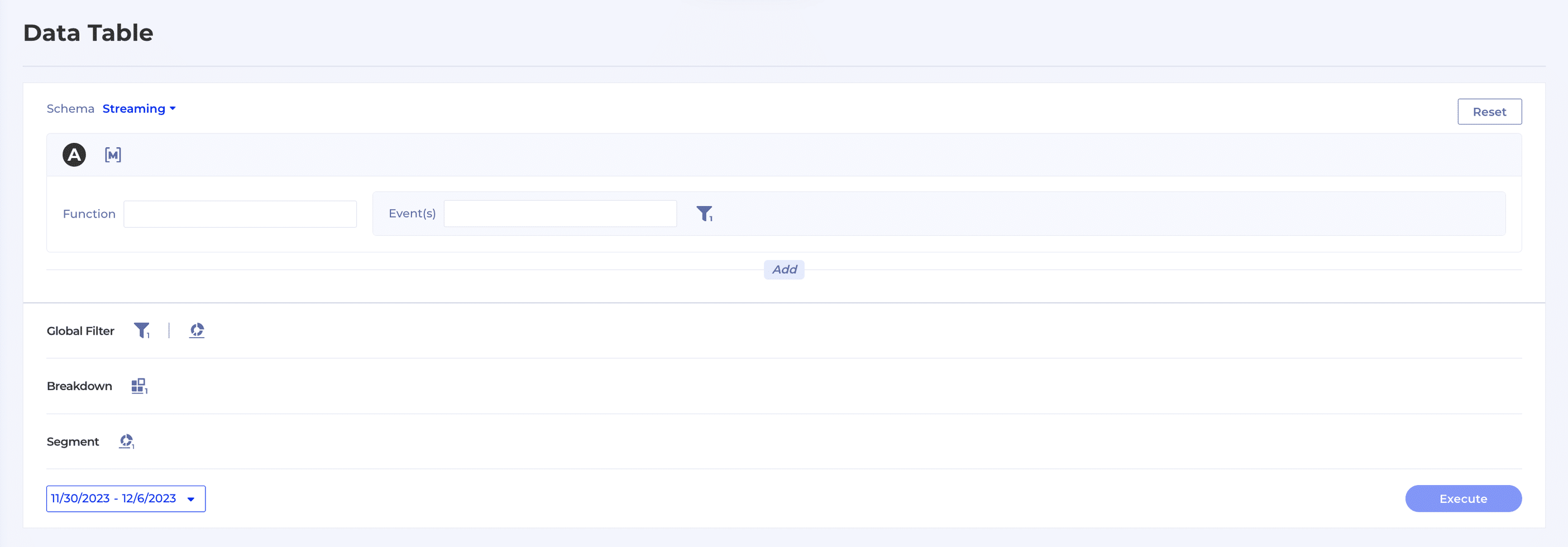
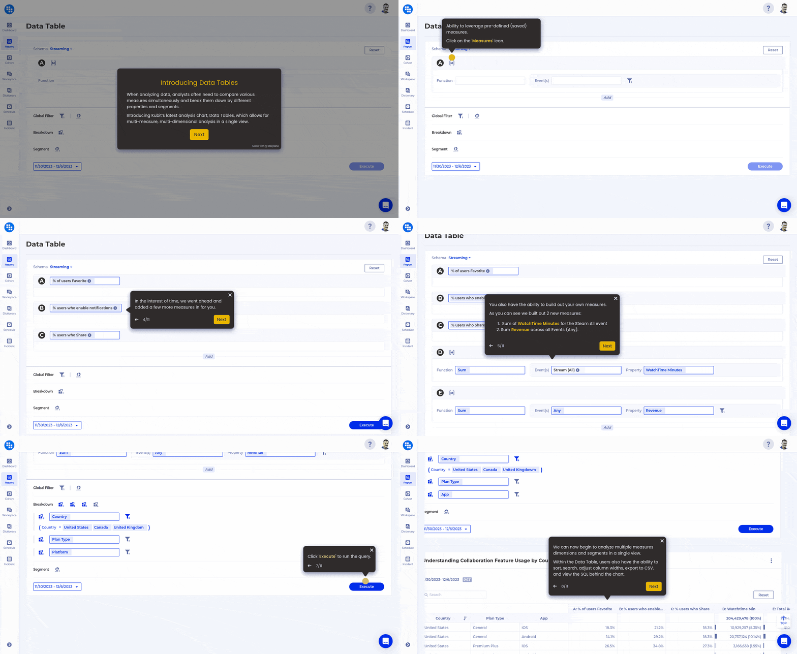
  2. As you can see from the snapshot below, the end user can easily begin adding new events, saved measures, breakdowns and segments.
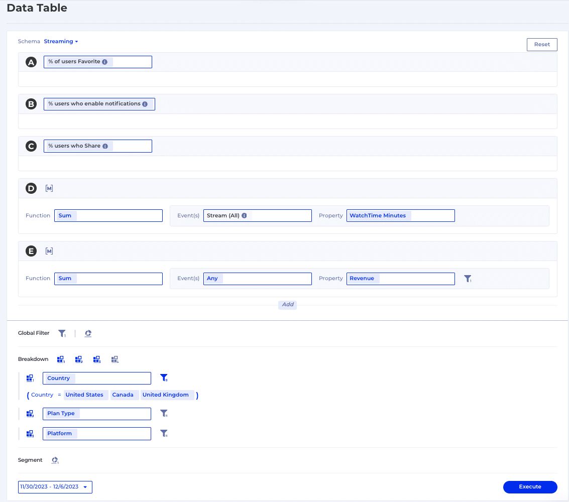
  1. Highlighted below is an example of a user selecting 3 saved measures, building 2 measures on the fly and breaking it down by Country (United States, Canada, United Kingdom), Plan Type and Platform.
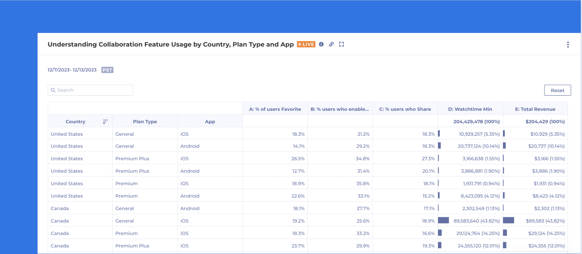
  1. When executed, the below table will be displayed. Users have the ability to sort, search, adjust columns widths, export to CSV, and view the SQL behind the chart.

Take it for a Ride

Now that you have a high level overview of Kubit’s Data Table, click through the guide below and get a feel for it yourself. If you’re interested in learning more, please reach out to our team.

Click the below GIF to walkthrough the demo.

Work around 5 common Data Quality issues with Kubit

Intro

We already know the perfect data model for product analytics but even with a perfect data model you can get tripped by other data issues on your way to obtaining insights. It often happens that a data issue is uncovered while working on a report in Kubit and it suddenly blocks the task at hand. Unfortunately, data issues typically take time to fix – in the best case scenario as early as the next sprint, often a month or two and in some rare cases the issue cannot be resolved at all. So while at Kubit we advocate for data modeling and data governance best practices, we have also developed a few features to help you work around 5 typical data issues in a self-service fashion while the root cause is being addressed:

  • Missing Data
  • Duplicate Data
  • Ambiguous Data
  • Inconsistent Data
  • Too Much Data

In this blog post we’ll explore how you can leverage these features to save the day whenever a data issue tries to stop you from getting your work done!

1. Incomplete Data

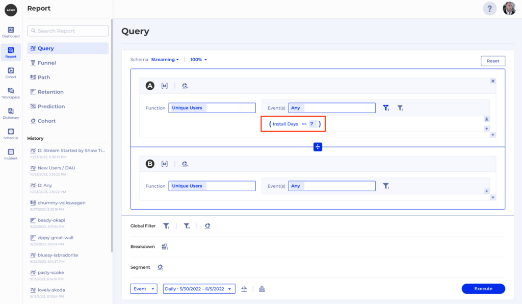
Very often we have some building blocks in our data but we don’t quite have the value we want to filter by. For example, we may have a timestamp property generated when a user installs our app, but for our report we want to measure the percentage of daily active users who installed our app within 7 days. Or we might want to filter by session duration but this information is not available when each event is triggered and must be computed afterwards. Or we may even want to extract the user’s device platform from a user-agent header.

Whenever this is the case you can reach out to the Kubit team to define what we call a “virtual property” which will be computed on the fly on top of your existing data. To continue our first example, let’s call the virtual property Install Days and it will be based on a timestamp column named  install_date. Now we can think of our virtual property in SQL like this:

datediff(day,install_date,event_date)

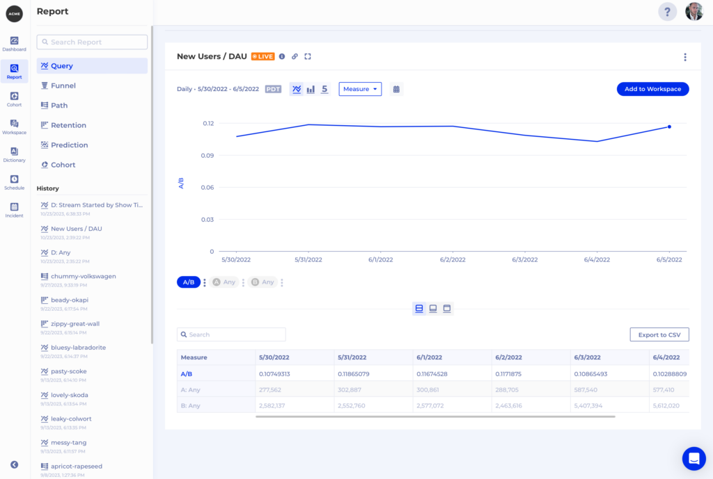
However, it looks like and is used as any other property within Kubit which makes our analysis very simple –  we get the amount of unique users who are active and filter by  Install Days <= 7, then divide that by the total number of daily active users like this:

2. Duplicate Data

Duplicate Data is always a pain to deal with and in the context of product insights we usually see it in the form of duplicate events. You can already leverage Kubit’s zero-ETL integration to do as much data scrubbing as you need. The results of your work will be immediately available in Kubit without any extra effort required. However, we often get asked to try and resolve some duplication on the fly – maybe the team who can fix the issue is overloaded, or there is some third-party responsible for the events generation – in both cases the process to resolve the issue will take any time between a lot and never.

Again, “virtual property” can come to the rescue, as we can generate a virtual property based on some criteria on only one of a set of duplicate events so we can distinguish it from the rest. Let’s consider the following example – imagine we have 5 purchase events for the same user, all for the same purchase but  at different timestamps:


user_id

event_name

purchase_id

event_date

purchase_amount

a7cb92df1c87c07fd

completed purchase

20041876

2023-10-23 15:23:11

$18.78

a7cb92df1c87c07fd

completed purchase

20041876

2023-10-23 17:05:47

$18.78

a7cb92df1c87c07fd

completed purchase

20041876

2023-10-24 10:32:03

$18.78

a7cb92df1c87c07fd

completed purchase

20041876

2023-10-25 22:11:59

$18.78

In this case, if we want to find the number of unique users who made a purchase, the duplication is not really a problem. But if we want to count the number of purchase events or aggregate the purchase_amounts, then our results will be way off.

How does Kubit fix this?

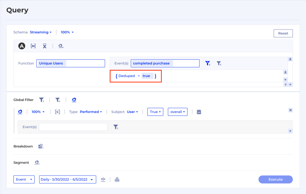
We can advise on the best solution, but one example is to assign a boolean property Deduped with a value true on the first of a sequence of duplicate events. Kubit can easily select the first duplicate event in a time range using some SQL along those lines:

CASE row_number = 1 ROW_NUMBER() OVER(PARTITION BY user_id, purchase_id ORDER BY event_date ASC NULLS LAST) AS row_number

And once we have the first event of the sequence we can assign the virtual property. So now we can aggregate without any adverse effects caused by the event duplication:

3. Ambiguous Data

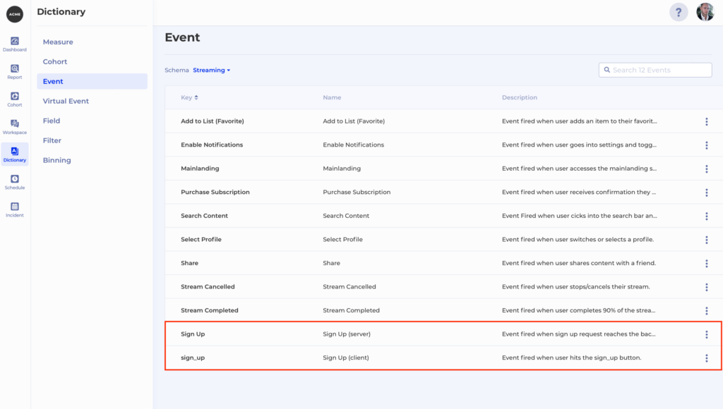
What if 2 events in our dataset are easy to confuse with one another? Perhaps the naming is not ideal and people often make mistakes when they need to use them for a report. Let’s say we see 2 Signup events in Kubit – Sign Up and sign_up

But what is the difference between the two? Maybe one is a front-end event and the other is a back-end event, but the names don’t reflect that. There is a quick fix you can make yourself in Kubit to make the difference between the two events much clearer. You can simply go to Dictionary -> Event and  Rename from the Context menu for both events to give them more appropriate names, e.g. Sign Up (server) and Sign Up (client), and a nice description:

4. Inconsistent Data

This is true especially for multi-platform apps. As soon as you start instrumenting on multiple platforms inevitably from time to time there will be discrepancies between the implementations which can result in any of the following issues:

  • the same event comes back with a different name from one or more platforms
  • property name is different on one or more platforms compared to the others
  • property value mismatch between platforms

4.1 Same event, different name

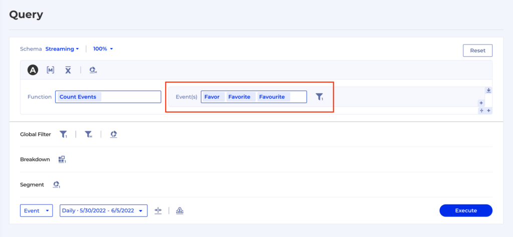
Let’s say we have the same event coming back from different platforms in 3 different flavors – FavorFavourites and Favorites.

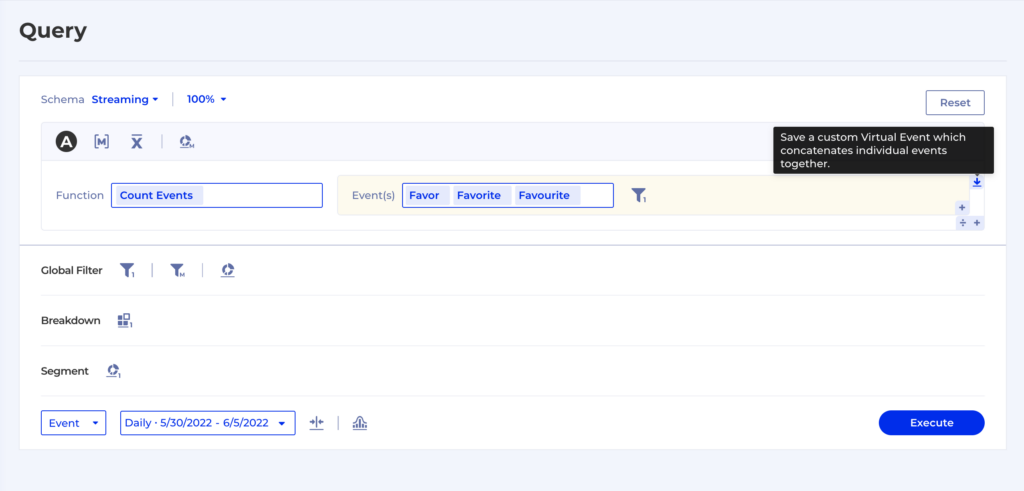
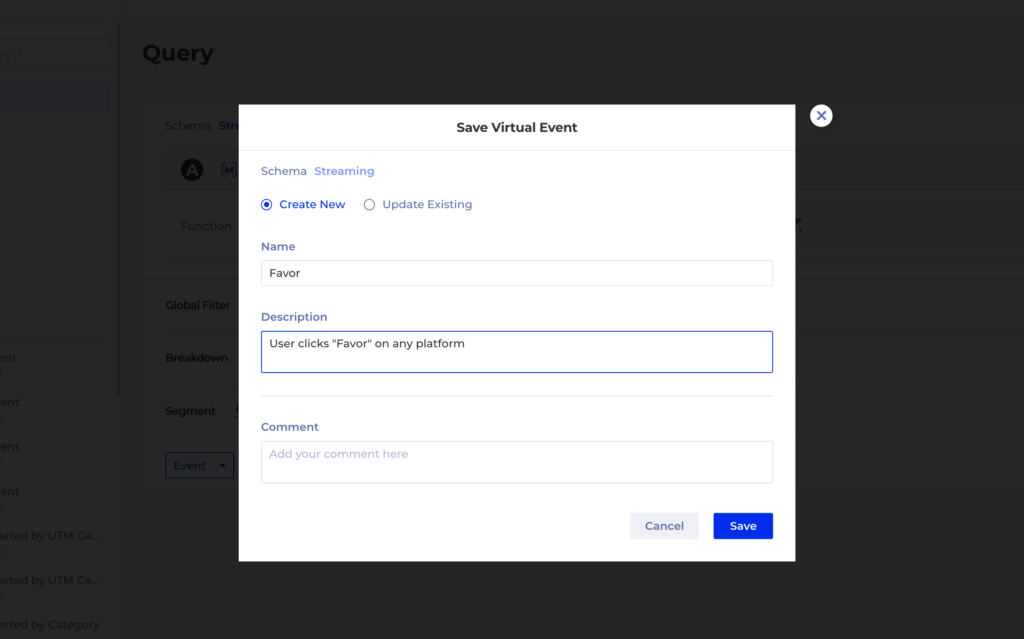
Such a situation can be extremely frustrating as you now have to go talk to multiple teams responsible for each instrumentation, align with their release schedules, prioritize the fix and wait for it to go live so you can go back and finish your work. This is one of the reasons why we developed Virtual Events as a way to group and filter raw level events to create new entities which have exactly the meaning we want them to.

It’s super easy to create a Virtual Event, anywhere in Kubit where you have an Event Group an a Filter you can save that combination like this:

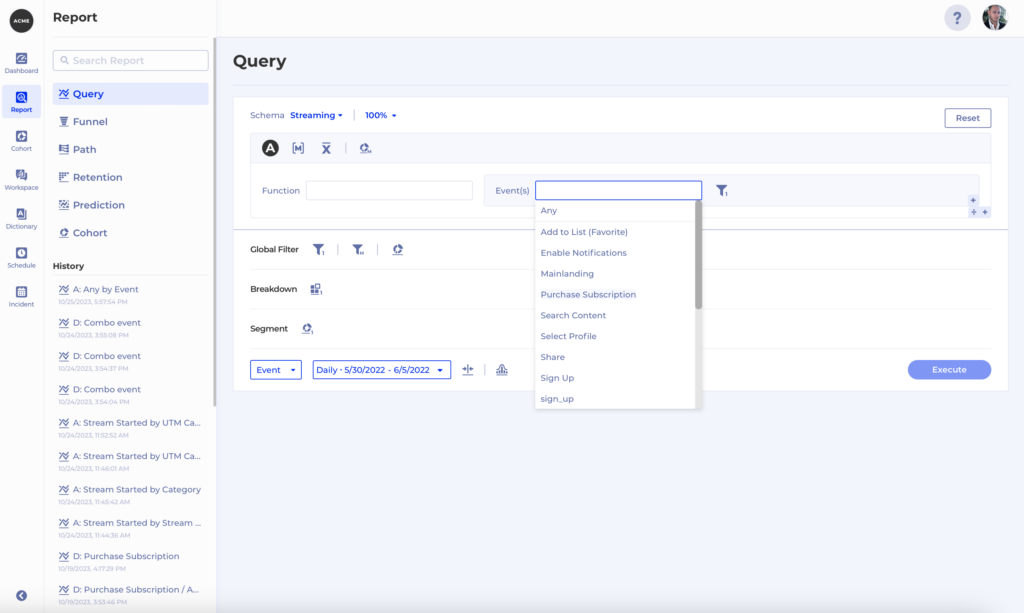
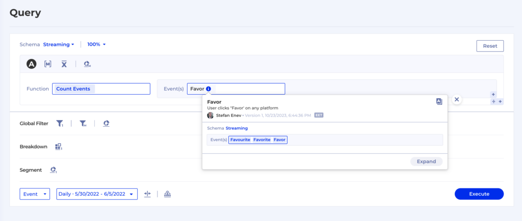
And then the Virtual Event will simply appear in any event drop-down with the rest of the regular events, so you can use it for all types of reports:

4.2 Property name mismatch

Let’s say we have a streaming platform and for all the streaming events we have a property called Stream Type. However, a typo was made when implementing the instrumentation on Android and the property is called Stream type instead. Now, for the purposes of our reports we want to treat these two as one and the same, so that our metrics don’t get skewed.

To fix this in the data warehouse properly we would need to:

  1. correct the Android instrumentation in a new app version
  2. go back in our historical data and fix the property name retrospectively

And we still haven’t solved the issue completely – what about all the people who are using older app versions and don’t have the instrumentation fix? They will keep generating data using the inconsistent property name. Turns out a simple typo will be causing us trouble for a long time in our reporting.

There’s 2 solutions which Kubit can provide to help you work around such issues:

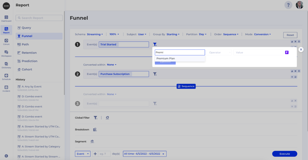
  1. You can create Named Filters using both property names and save them for reuse
  2. The Kubit team can easily make such configurations as to treat both properties as one and the same

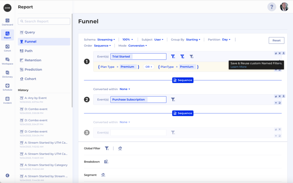
Let’s explore option #1. In this case we have 2 properties which are actually the same – Plan Type and PlanType. So whenever we want to filter by one of them we actually need to filter by both in order to ensure our filter is applied correctly: 

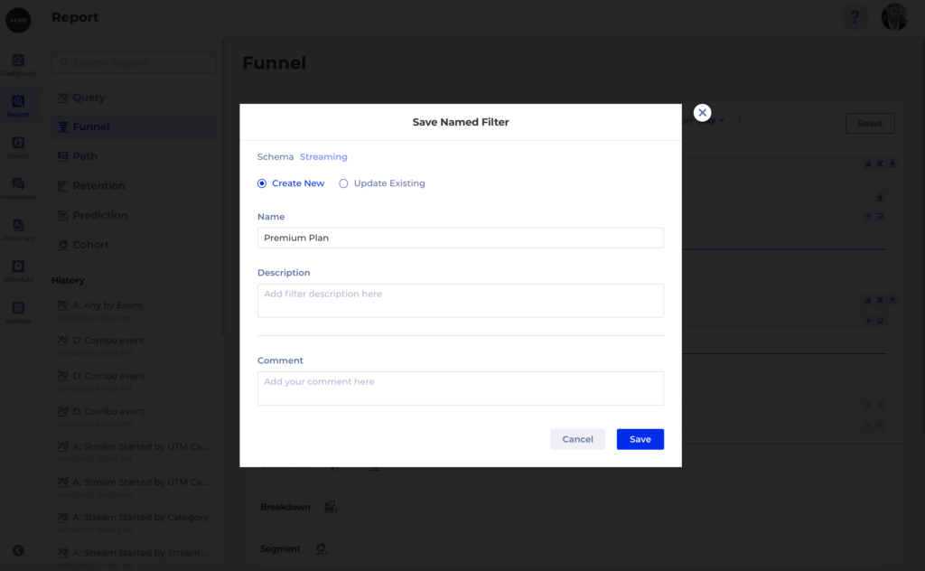
To help prevent mistakes you can then save a Named Filter which others can re-use. Also helps you save time by not having to create the same filter over and over again:

Once the filter is saved you can use it anywhere in Kubit:

4.3 Property value mismatch

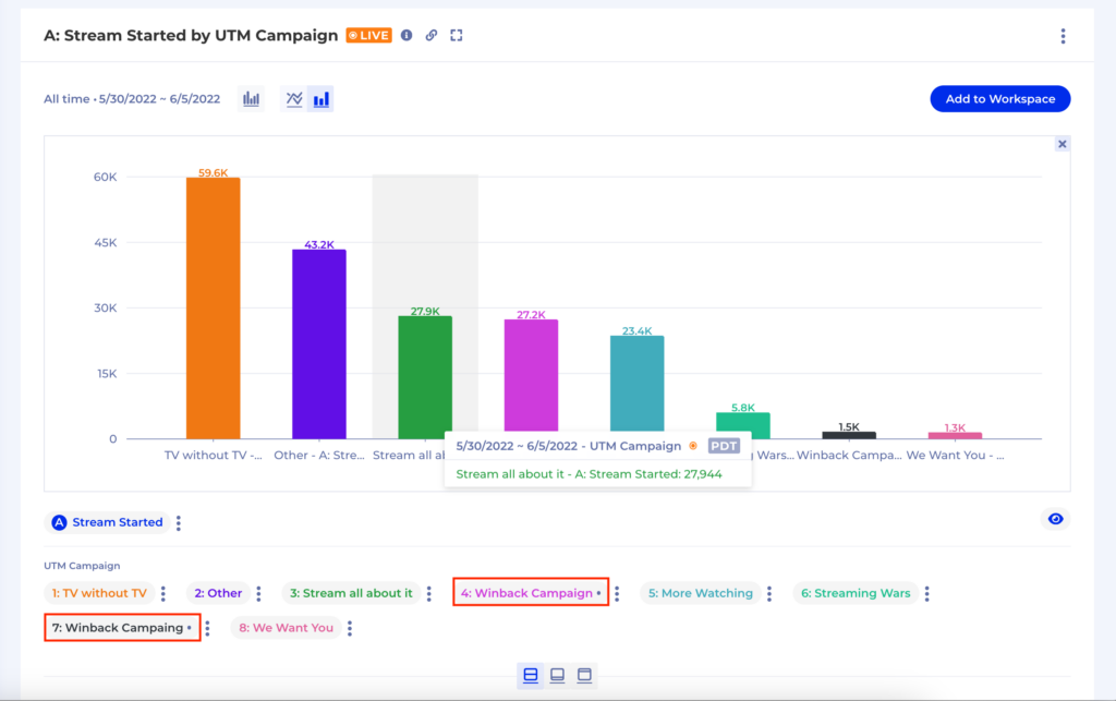
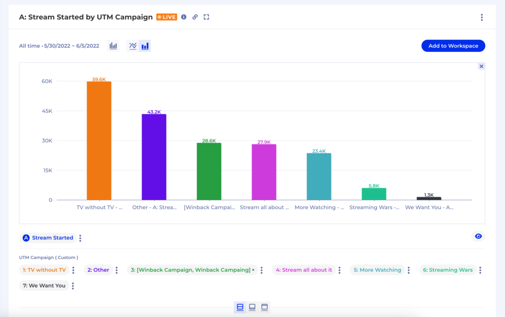
This typically wreaks havoc in our report when we group by that property. For instance, a simple typo in a property value will lead to our report containing 2 groups of the same thing instead of 1 as in the example below:

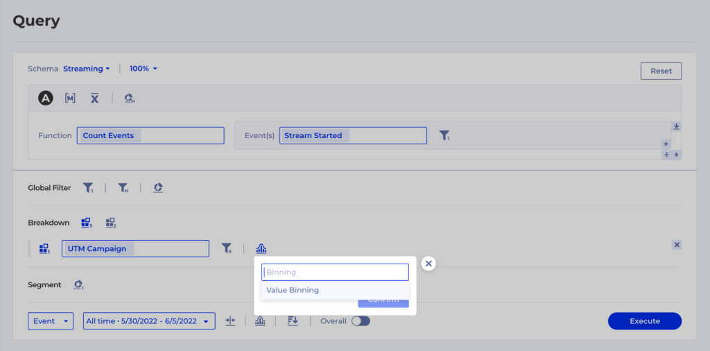
To overcome issues like this on the spot you can use Kubit’s Binning feature:

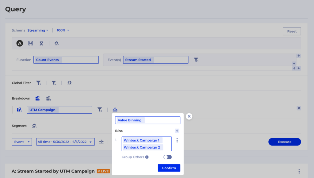
Using the Value Binning option you can define custom Groups – in this case we want to merge back Winback Campaign and Winback Campaing into one group and then we want to leave  Group Othersturned off so all the other groups remain as they were:

Congratulations, you’ve successfully removed the extra group from your report:

5. Too Much Data

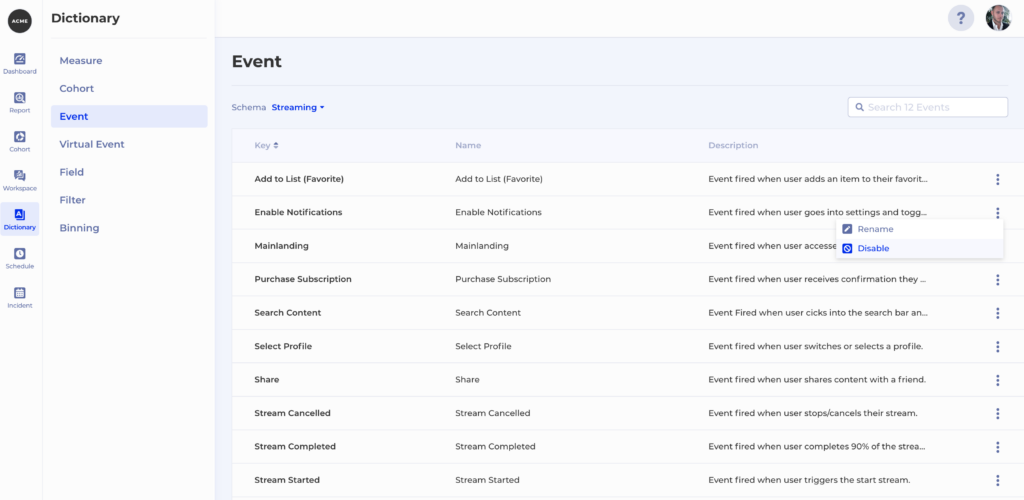
What if our perfect data model contains more event types than we need for our analytical purposes? Or we have an event which is still noisy and in the process of being fixed, so we want to prevent people from relying on it in their reports?

The Dictionary feature in Kubit keeps track of all your terms – Events and Fields coming from the raw data and also concepts defined by you such as Measure and Cohort. Dictionary also allows you to easily disable an event, which means it will no longer be available for selection in any event drop-down in Kubit. All you have to do is go to Dictionary -> Event and then hit Disable from the context menu of the event you want to hide:

Note that in the case where you are dealing with a noisy event you can easily enable it once the underlying issues with the event generation have been resolved.

Outro

We just explored 5 ways to overcome common data quality issues in Kubit and get to your insights on time. The best part is that all of these solutions are dynamic and the mapping happens at runtime so you can take action immediately. You don’t ever need to invest in complex ETL jobs to update and backfill data. This also gives you the ability to test some hypotheses with real data with live product insights.

At Kubit, we want our customers to have the best possible experience, so please, do let us know what else you would like to get from Kubit to tackle data quality issues!