Explore your data with Multi-Dimensional Data Tables

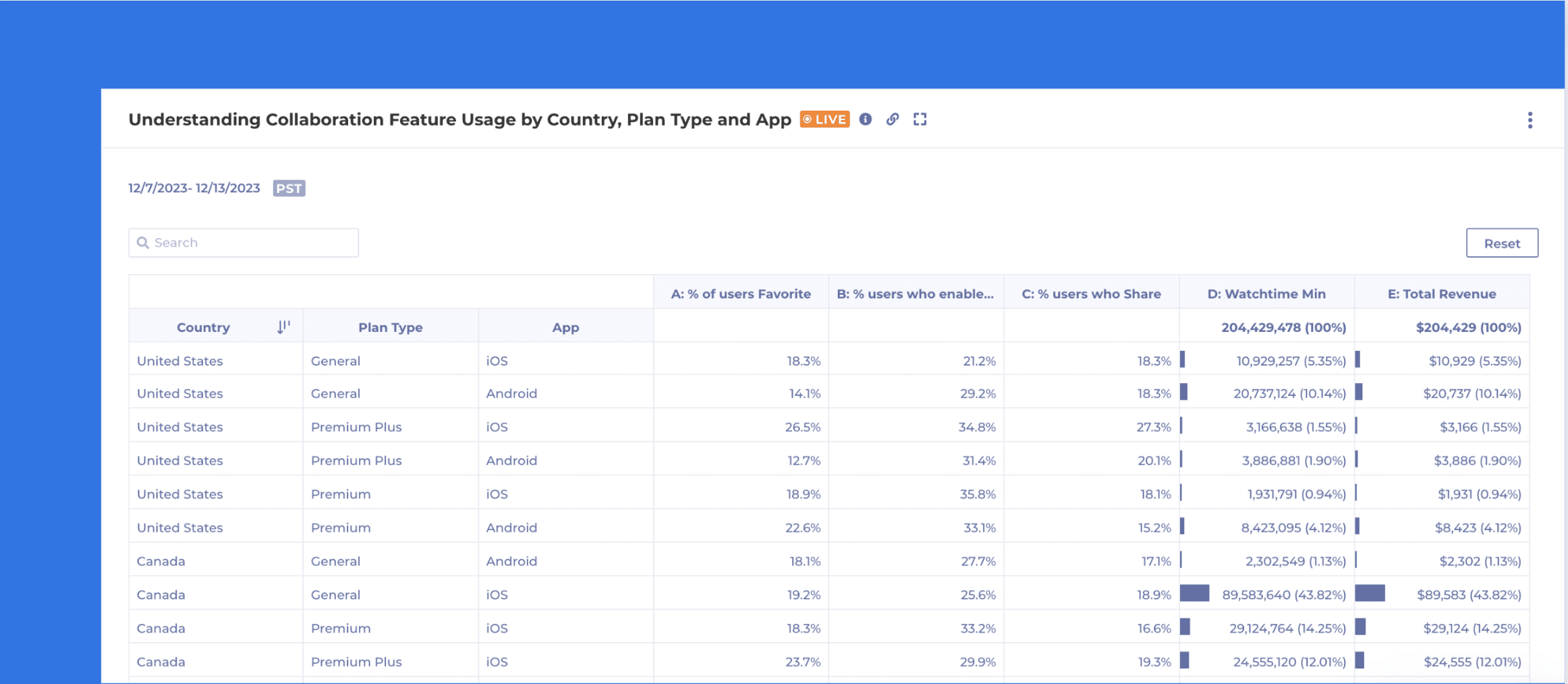
When analyzing data, analysts often need to compare various measures simultaneously and break them down by different properties and segments. Introducing Kubit’s latest analysis chart, Data Tables, which allows for multi-measure, multi-dimensional analysis in a single view.

Tools like Excel and Sheets have provided this type of data visualization and it works! While you may still want to see data in funnels, lines, bars and pie graphs; it can sometimes be best to see it laid out in a table view.

Our Customers are using Data Tables to understand things like:

  1. Cross Tab Analysis
    • How are User engagement metrics across different user segments and features?
  2. Custom Measures and KPI Analysis
    • Compare custom-defined measures or KPIs across different dimensions
  3. Segmented A/B Testing
    • Analyze user segments by control vs. variant groups
  4. Impact of Marketing Campaigns
    • Show click through rate, conversion rate by user segments and Campaigns all in one report

Getting Started with Data Tables:

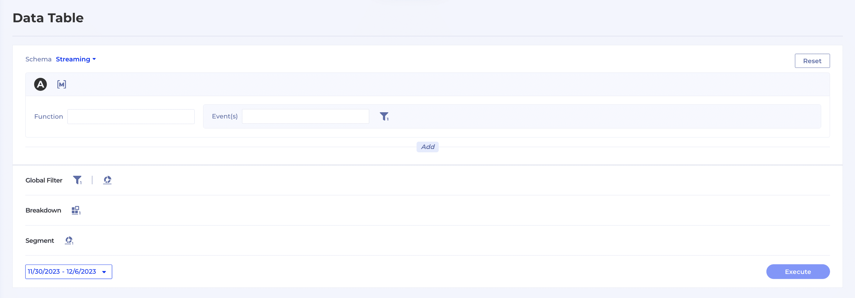
  1. Navigate to Report → Data Table.
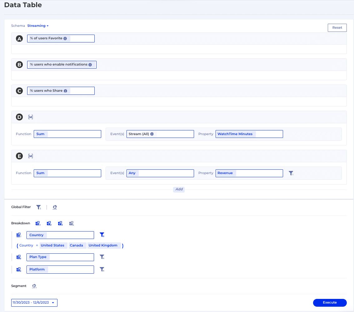
  2. As you can see from the snapshot below, the end user can easily begin adding new events, saved measures, breakdowns and segments.
  1. Highlighted below is an example of a user selecting 3 saved measures, building 2 measures on the fly and breaking it down by Country (United States, Canada, United Kingdom), Plan Type and Platform.
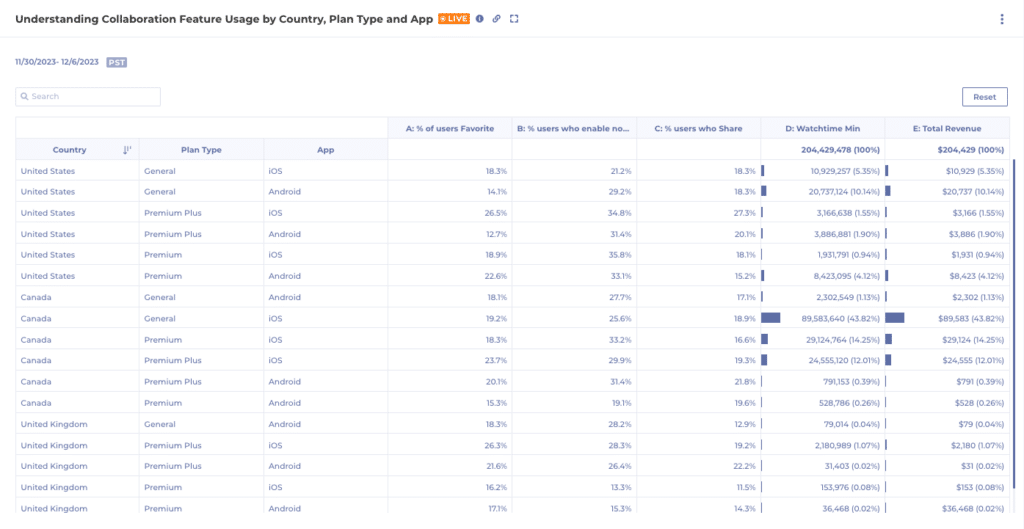
  1. When executed, the below table will be displayed. Users have the ability to sort, search, adjust columns widths, export to CSV, and view the SQL behind the chart.

Take it for a Ride

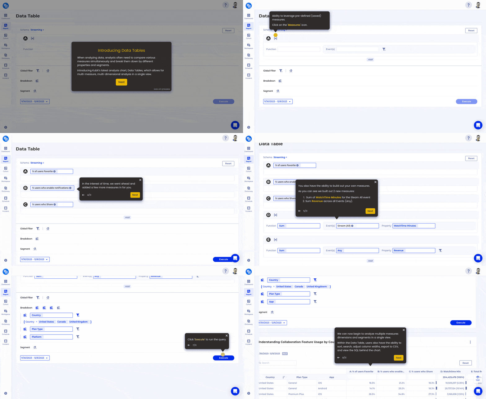
Now that you have a high level overview of Kubit’s Data Table, click through the guide below and get a feel for it yourself. If you’re interested in learning more, please reach out to our team.

Click the below GIF to walkthrough the demo.

Work around 5 common Data Quality issues with Kubit

Intro

We already know the perfect data model for product analytics but even with a perfect data model you can get tripped by other data issues on your way to obtaining insights. It often happens that a data issue is uncovered while working on a report in Kubit and it suddenly blocks the task at hand. Unfortunately, data issues typically take time to fix – in the best case scenario as early as the next sprint, often a month or two and in some rare cases the issue cannot be resolved at all. So while at Kubit we advocate for data modeling and data governance best practices, we have also developed a few features to help you work around 5 typical data issues in a self-service fashion while the root cause is being addressed:

  • Missing Data
  • Duplicate Data
  • Ambiguous Data
  • Inconsistent Data
  • Too Much Data

In this blog post we’ll explore how you can leverage these features to save the day whenever a data issue tries to stop you from getting your work done!

1. Incomplete Data

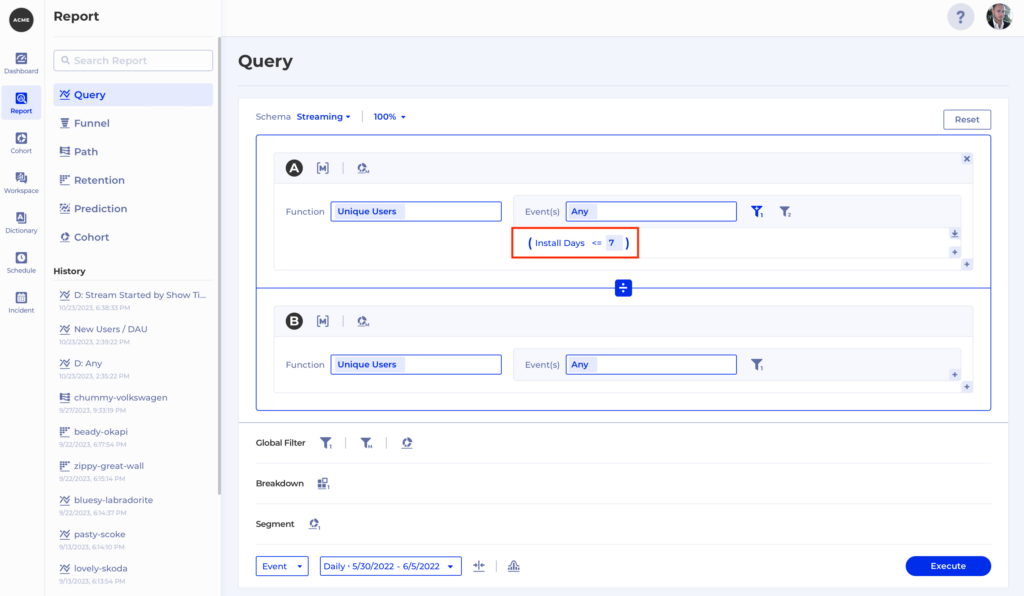
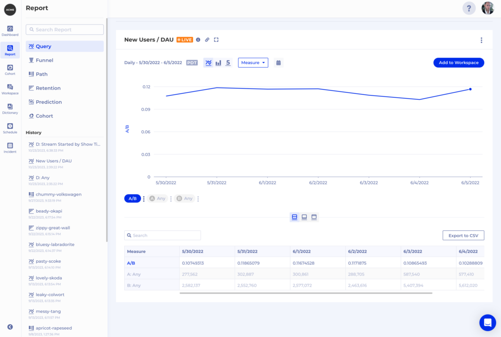
Very often we have some building blocks in our data but we don’t quite have the value we want to filter by. For example, we may have a timestamp property generated when a user installs our app, but for our report we want to measure the percentage of daily active users who installed our app within 7 days. Or we might want to filter by session duration but this information is not available when each event is triggered and must be computed afterwards. Or we may even want to extract the user’s device platform from a user-agent header.

Whenever this is the case you can reach out to the Kubit team to define what we call a “virtual property” which will be computed on the fly on top of your existing data. To continue our first example, let’s call the virtual property Install Days and it will be based on a timestamp column named  install_date. Now we can think of our virtual property in SQL like this:

datediff(day,install_date,event_date)

However, it looks like and is used as any other property within Kubit which makes our analysis very simple –  we get the amount of unique users who are active and filter by  Install Days <= 7, then divide that by the total number of daily active users like this:

2. Duplicate Data

Duplicate Data is always a pain to deal with and in the context of product insights we usually see it in the form of duplicate events. You can already leverage Kubit’s zero-ETL integration to do as much data scrubbing as you need. The results of your work will be immediately available in Kubit without any extra effort required. However, we often get asked to try and resolve some duplication on the fly – maybe the team who can fix the issue is overloaded, or there is some third-party responsible for the events generation – in both cases the process to resolve the issue will take any time between a lot and never.

Again, “virtual property” can come to the rescue, as we can generate a virtual property based on some criteria on only one of a set of duplicate events so we can distinguish it from the rest. Let’s consider the following example – imagine we have 5 purchase events for the same user, all for the same purchase but  at different timestamps:


user_id

event_name

purchase_id

event_date

purchase_amount

a7cb92df1c87c07fd

completed purchase

20041876

2023-10-23 15:23:11

$18.78

a7cb92df1c87c07fd

completed purchase

20041876

2023-10-23 17:05:47

$18.78

a7cb92df1c87c07fd

completed purchase

20041876

2023-10-24 10:32:03

$18.78

a7cb92df1c87c07fd

completed purchase

20041876

2023-10-25 22:11:59

$18.78

In this case, if we want to find the number of unique users who made a purchase, the duplication is not really a problem. But if we want to count the number of purchase events or aggregate the purchase_amounts, then our results will be way off.

How does Kubit fix this?

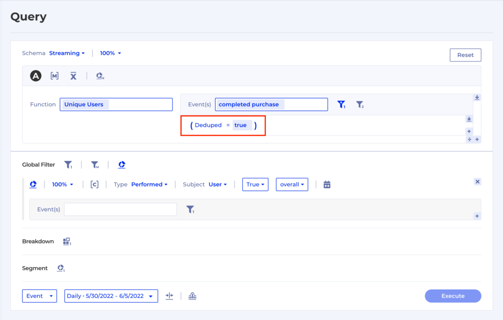
We can advise on the best solution, but one example is to assign a boolean property Deduped with a value true on the first of a sequence of duplicate events. Kubit can easily select the first duplicate event in a time range using some SQL along those lines:

CASE row_number = 1 ROW_NUMBER() OVER(PARTITION BY user_id, purchase_id ORDER BY event_date ASC NULLS LAST) AS row_number

And once we have the first event of the sequence we can assign the virtual property. So now we can aggregate without any adverse effects caused by the event duplication:

3. Ambiguous Data

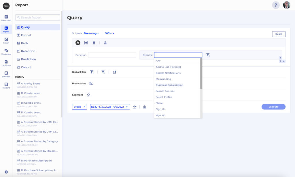
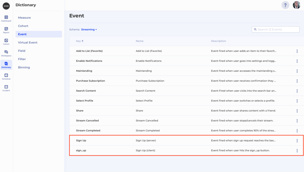
What if 2 events in our dataset are easy to confuse with one another? Perhaps the naming is not ideal and people often make mistakes when they need to use them for a report. Let’s say we see 2 Signup events in Kubit – Sign Up and sign_up

But what is the difference between the two? Maybe one is a front-end event and the other is a back-end event, but the names don’t reflect that. There is a quick fix you can make yourself in Kubit to make the difference between the two events much clearer. You can simply go to Dictionary -> Event and  Rename from the Context menu for both events to give them more appropriate names, e.g. Sign Up (server) and Sign Up (client), and a nice description:

4. Inconsistent Data

This is true especially for multi-platform apps. As soon as you start instrumenting on multiple platforms inevitably from time to time there will be discrepancies between the implementations which can result in any of the following issues:

  • the same event comes back with a different name from one or more platforms
  • property name is different on one or more platforms compared to the others
  • property value mismatch between platforms

4.1 Same event, different name

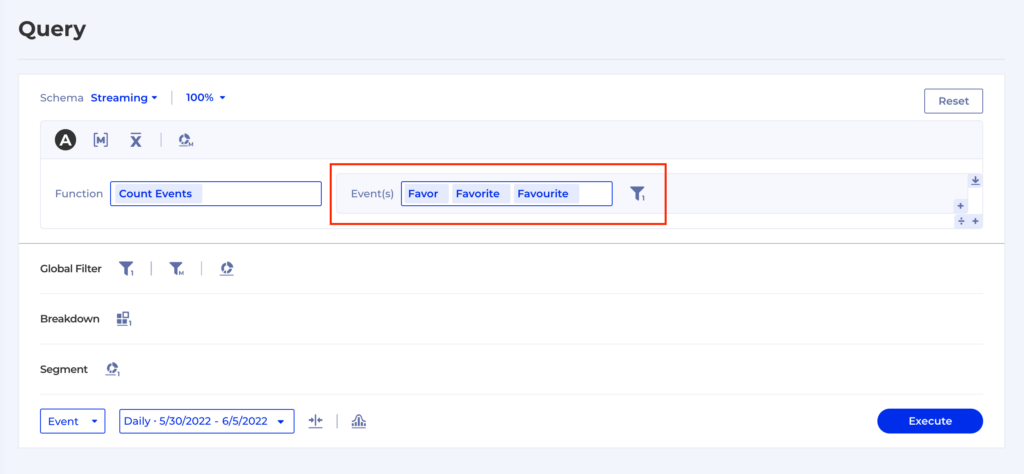
Let’s say we have the same event coming back from different platforms in 3 different flavors – FavorFavourites and Favorites.

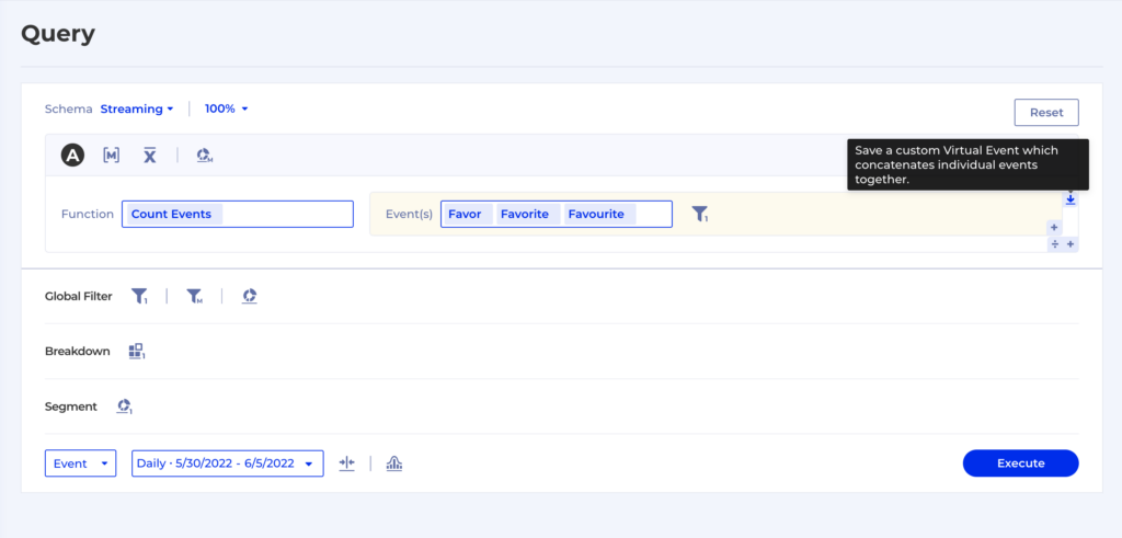
Such a situation can be extremely frustrating as you now have to go talk to multiple teams responsible for each instrumentation, align with their release schedules, prioritize the fix and wait for it to go live so you can go back and finish your work. This is one of the reasons why we developed Virtual Events as a way to group and filter raw level events to create new entities which have exactly the meaning we want them to.

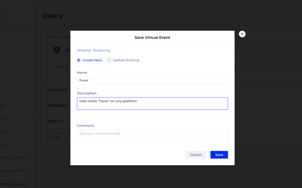
It’s super easy to create a Virtual Event, anywhere in Kubit where you have an Event Group an a Filter you can save that combination like this:

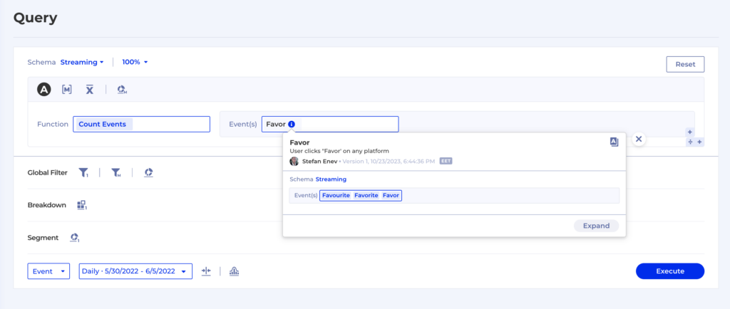
And then the Virtual Event will simply appear in any event drop-down with the rest of the regular events, so you can use it for all types of reports:

4.2 Property name mismatch

Let’s say we have a streaming platform and for all the streaming events we have a property called Stream Type. However, a typo was made when implementing the instrumentation on Android and the property is called Stream type instead. Now, for the purposes of our reports we want to treat these two as one and the same, so that our metrics don’t get skewed.

To fix this in the data warehouse properly we would need to:

  1. correct the Android instrumentation in a new app version
  2. go back in our historical data and fix the property name retrospectively

And we still haven’t solved the issue completely – what about all the people who are using older app versions and don’t have the instrumentation fix? They will keep generating data using the inconsistent property name. Turns out a simple typo will be causing us trouble for a long time in our reporting.

There’s 2 solutions which Kubit can provide to help you work around such issues:

  1. You can create Named Filters using both property names and save them for reuse
  2. The Kubit team can easily make such configurations as to treat both properties as one and the same

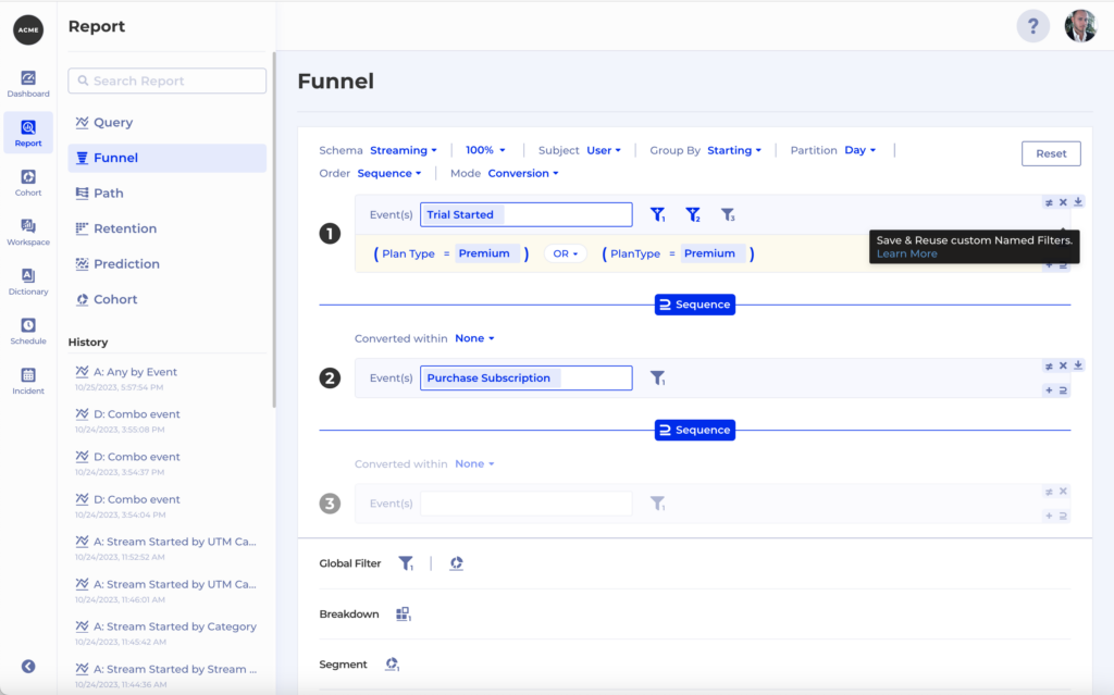
Let’s explore option #1. In this case we have 2 properties which are actually the same – Plan Type and PlanType. So whenever we want to filter by one of them we actually need to filter by both in order to ensure our filter is applied correctly: 

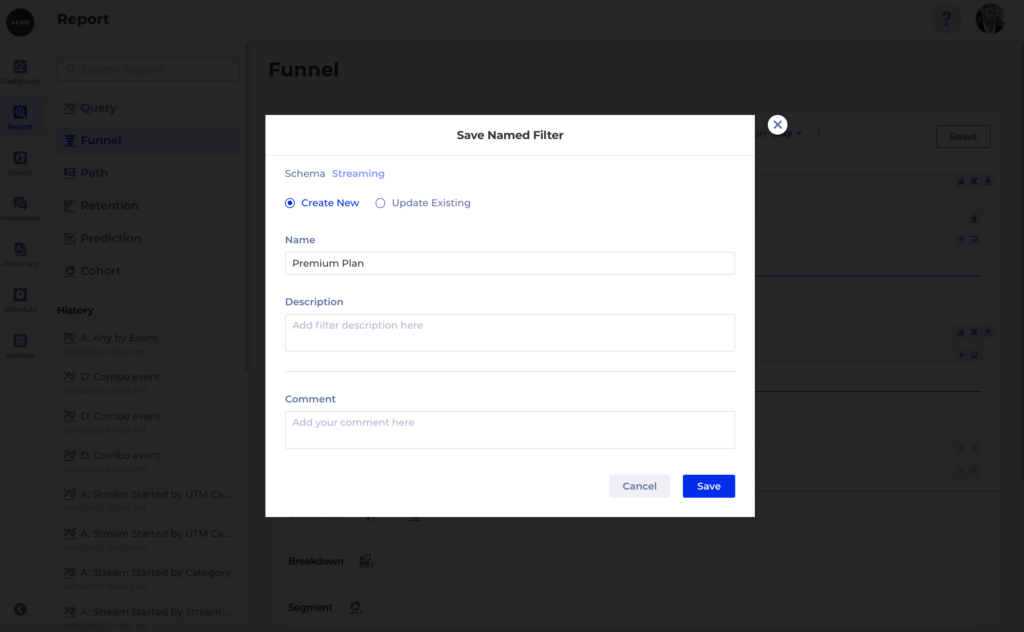
To help prevent mistakes you can then save a Named Filter which others can re-use. Also helps you save time by not having to create the same filter over and over again:

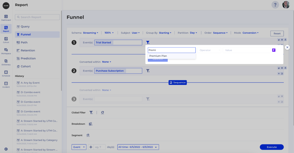
Once the filter is saved you can use it anywhere in Kubit:

4.3 Property value mismatch

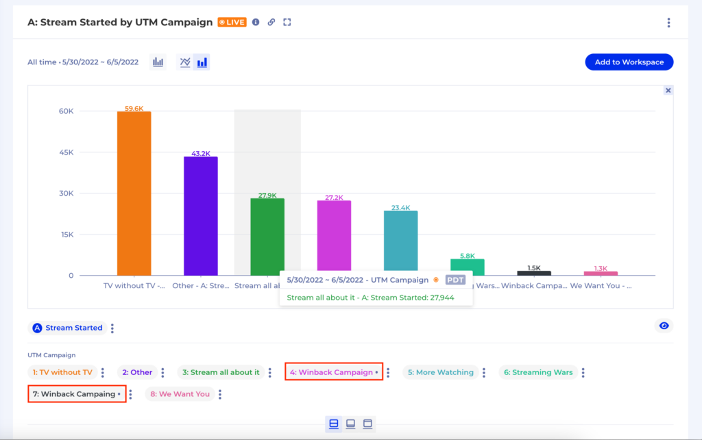
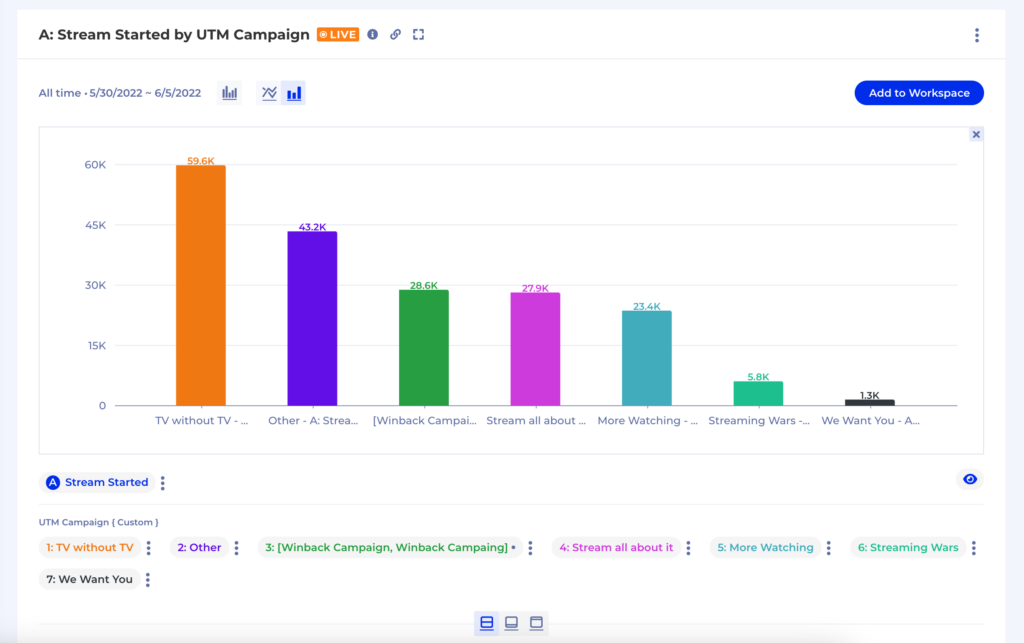
This typically wreaks havoc in our report when we group by that property. For instance, a simple typo in a property value will lead to our report containing 2 groups of the same thing instead of 1 as in the example below:

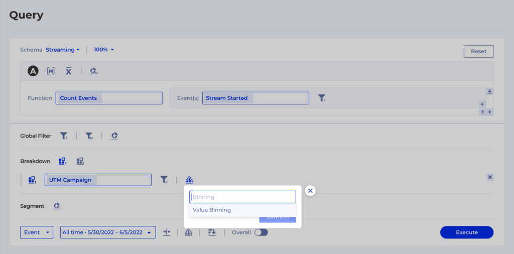
To overcome issues like this on the spot you can use Kubit’s Binning feature:

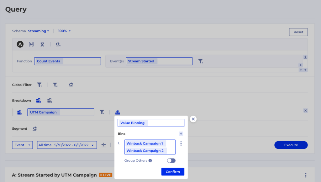
Using the Value Binning option you can define custom Groups – in this case we want to merge back Winback Campaign and Winback Campaing into one group and then we want to leave  Group Othersturned off so all the other groups remain as they were:

Congratulations, you’ve successfully removed the extra group from your report:

5. Too Much Data

What if our perfect data model contains more event types than we need for our analytical purposes? Or we have an event which is still noisy and in the process of being fixed, so we want to prevent people from relying on it in their reports?

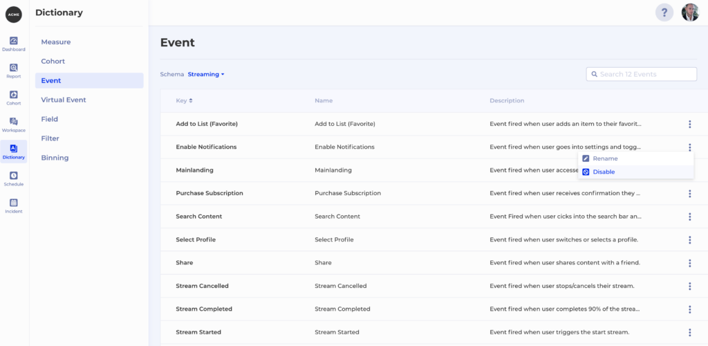
The Dictionary feature in Kubit keeps track of all your terms – Events and Fields coming from the raw data and also concepts defined by you such as Measure and Cohort. Dictionary also allows you to easily disable an event, which means it will no longer be available for selection in any event drop-down in Kubit. All you have to do is go to Dictionary -> Event and then hit Disable from the context menu of the event you want to hide:

Note that in the case where you are dealing with a noisy event you can easily enable it once the underlying issues with the event generation have been resolved.

Outro

We just explored 5 ways to overcome common data quality issues in Kubit and get to your insights on time. The best part is that all of these solutions are dynamic and the mapping happens at runtime so you can take action immediately. You don’t ever need to invest in complex ETL jobs to update and backfill data. This also gives you the ability to test some hypotheses with real data with live product insights.

At Kubit, we want our customers to have the best possible experience, so please, do let us know what else you would like to get from Kubit to tackle data quality issues!

Accurate vs. Directional: The Tradeoff that Product Leaders Need to Make… Or Do They?

One of the first questions I’ve seen asked in those big meetings, the ones we’ve all spent weeks or even months preparing for, is this: “Are these numbers accurate, or more directional?” 

You break into a cold sweat… 

I think they’re accurate?…

I think we used the same data from our main source of truth?… 

Then, you nod in full confidence. “These are more… directional… For now.”

What a relief. Weight lifted off. Now, the meeting can continue.

But something changed, without anyone saying a word. 

A giant shadow has fallen over the meeting. You realize that future facts and figures you present may be seen with that shadow hanging overhead. 

Result: you didn’t make the impact you’d hoped for.

Confidence now clouded by directionality

The tradeoff between numbers being accurate vs. being directional is an ongoing battle – and one that’s particularly challenging in Product Analytics, for reasons I’m going to explore in this article. 

But first, a quick reminder of what we mean when we say “accurate” vs. “directional.” 

“Accuracy” is when the information derived from your data can be confidently shared with internal and external stakeholders; it’s been “blessed” as delivered from your Single Source of Truth. 

“Directional,” by contrast, refers to information that’s considered “good enough” to validate or justify initial decisions. Generally, directional data is not good enough to form the basis of the final numbers you present. And it certainly should not be part of the measurable outcomes shared with your stakeholders.

Often, the outcome of the accuracy-vs.-directional struggle isn’t poor decision-making, but a lack of decision-making; if you’re unsure of the accuracy of your data, then the default is to not take any action based upon it. 

But, in Product Analytics, sometimes the worst thing you can do is nothing. Product Managers (PMs) are often expected to make decisions quickly – decisions that can have a major impact on revenue and user engagement.


Why accuracy vs. directionality is challenging in Product Analytics 

There are two reasons why Product Analytics is unique when it comes to accuracy-vs.-directionality.

First, Product has an ENORMOUS amount of data. I’m talking trillions of events per day in some cases. 

For many organizations, this data is monstrous, ever-changing, and non-standard. This means that fitting their product data into existing solutions for data governance becomes very challenging. Example: “Active User definition at Company A does not equal Active User definition at Company B.”

The second reason why the accuracy-vs.-directionality question is tricky in Product Analytics: Product people are relatively new to data being a core part of their day-to-day work, compared to teams like Business Intelligence (BI) or even Marketing – which have always been front-and-center in the data game. Building confidence in the data they use and making decisions off of it can be challenging for PMs, especially when it comes to the accuracy-vs.-directional tradeoff.

(Secret third reason… I work for a company that specializes in Product Analytics, Kubit… We all know what we are doing here, right?? 😂)

Weighted Scale Confusion

Traditionally, Product Managers shared data internally, and sometimes weren’t asked for data at all because it was too cumbersome to wrangle; however the prophecy that Product would become the profit center is coming true across many industries. With that high visibility, Product’s key numbers–like Monthly Active Users (MAU), total downloads, activated users from free-to-paid, etc.–have risen to the highest level of importance, sitting alongside the dollars and cents. This is an amazing development. 

But with higher visibility comes greater scrutiny. 

In this new Product-first world, the de facto mode must be accuracy. PMs and Data Engineers can no longer rely on directional metrics.


So, how do you make accuracy your de facto mode?

Collecting information is step one, and there are several methods that businesses use to accomplish this. Each has their own tradeoff and nuance (a topic that we can dive into in another blog), but let’s run through the highlights. 

Tools that have their own data collection methods tend to be inflexible, forcing you to conform your data into their schema. Maybe you’ve been farming the collection out to an auto-tracking tool, or you trust the logging done to monitor uptime as “events.” These collection methods can lead to data that’s potentially accurate, but that may be prone to misalignment with how YOUR business thinks about this data. 

The only way a company can fully understand where and how its product data came to be: first-party collection. But even first-party collection can be challenging! 

So what do you do?

You collect stuff, using whichever method you decide. You need this data to make decisions on your product bets, experiments, and growth strategies. My point of view aligns with what we’re seeing in the market today: an increasing awareness that product data must live inside an organization’s source-of-truth data warehouse

Typically, data warehouses and BI reports are designed, governed, and maintained to uphold a single source of truth. If we want Product Analytics data to hold the weight it deserves, then it too must live up to this standard.

So… Once your Product Analytics data is stored in the data warehouse, you have the ability to access it via multiple solutions, and you’ve achieved accuracy nirvana…right? Not so fast.

Now, you have to decide how you want to analyze this data. Tools available in the Product Analytics space typically follow the same value proposition: “send us your data, and we’ll optimize it for you so you can run high-performance queries on complex user journeys.” This is great! Until… certain limitations arise. 

When your user base grows and events balloon, now you have to pay a large bill, or begin pruning that data via sampling or excluding events. Another problem: you’ve also created another “source of truth,” because the data has left the warehouse. When it breaks, who fixes it? Now, we’re creeping into directional territory…

Before you know it, you can see the directionality shadow encroaching into your next Product leadership meeting.

With next-gen tools, directional data can be a thing of the past

To avoid the accuracy-vs.-directionality tradeoff, a new generation of tools have emerged that leverage your data warehouse directly – no sampling or pruning needed, and no alternative “truth” sources created in silos. These new solutions provide insights using existing data investments made by your organization, leveraging the cloud and removing the requirement to ship data outside your firewalls. The result of this warehouse-native approach: you have Product Managers who are enabled to work with fully accurate data.

Rachel Herrera leads Customer Success at Kubit, the first warehouse-native Product Analytics platform. Do you have thoughts on accuracy-vs.-directionality or on improving your product analytics workflows or infrastructure? Drop her a note at rachel.herrera@kubit.co.

Four Product Analytics Trends Worth Investigating

Product Analytics Is A Field That’s Constantly Evolving, And It’s Important For Companies To Stay Up-To-Date On The Latest Trends And Technologies In Order To Make Informed Decisions About Their Products. In This Blog Post, We’ll Explore Some Of The Latest Trends We’ve Been Observing In Both Medium-Sized And Large Companies.

Product Analytics is a field that’s constantly evolving, and it’s important for companies to stay up to date on the latest trends and technologies in order to make informed decisions about their products. In this blog post, we’ll explore some of the latest trends we’ve been observing in both medium-sized and large companies.

Holistic Data Integration

One trend that’s quickly gaining traction is the integration of qualitative and quantitative data to gain a more complete picture of product performance and customer behavior. While traditional product analytics have focused mainly on metrics such as retention and conversion rates, companies are now seeking to understand the “why” behind these numbers. This shift towards a more holistic approach has led to an increase in the use of customer feedback, surveys, and user testing to complement traditional metrics. This integration of data sources provides a more in-depth understanding of how customers use and perceive products, which can then inform product development and marketing strategies.

Machine Learning and Artificial Intelligence in Product Analytics

The second trend on our list is the use of machine learning and artificial intelligence in product analytics. Machine learning algorithms can be used to analyze large amounts of data and identify patterns and insights that would be difficult or impossible to find manually. Some examples of machine learning and AI in the product analytics world include anomaly detection and root cause analysis. Both serve to increase data quality and remove incorrect findings.

Real-time Analytics

The third trend we’re seeing: with instant insights becoming more and more of a factor, real-time analytics are on the rise. This involves collecting and analyzing data as it is generated, rather than waiting for it to be processed and analyzed later. This allows companies to make faster and more informed decisions, which can be critical in today’s fast-paced business environment. As a growing number of companies adopt real-time analytics it will become increasingly important for product analytics professionals to have a strong understanding of the work of both the data team and the business teams. This will allow them to effectively communicate the insights and recommendations generated by their analyses to stakeholders and decision-makers, and to work closely with product managers and engineers to implement changes and improvements.

Warehouse-native Platforms

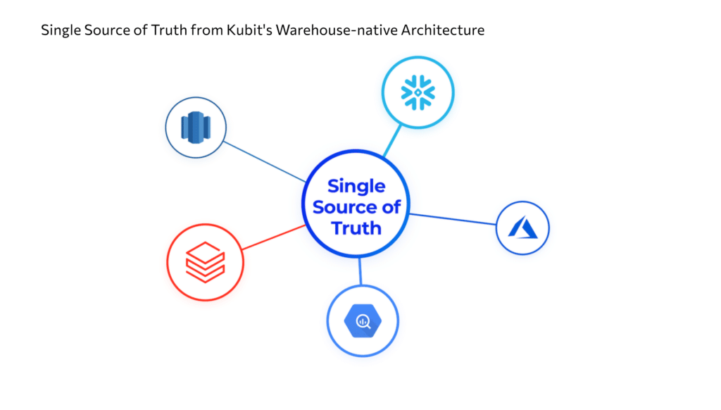
The last product analytics trend on our list is the emphasis on privacy and data security. Amid growing concerns and regulations about data privacy and security, companies are looking for ways to collect and analyze customer data without compromising their customers’ rights. This has led to the development of new technologies and techniques for anonymizing and aggregating data, allowing companies to gain insights without exposing individual customers. Additionally, companies are turning to warehouse-native product analytics solutions that do not require sending a copy of their data to a third party. Warehouse-native platforms allow companies to use their own data model, and they guarantee full control of the data, with a  single source of truth. By prioritizing privacy and security in their product analytics, companies can gain valuable insights while protecting the rights of their customers.

In conclusion, the field of product analytics is constantly evolving, and companies that want to stay competitive in the future will need to stay up to date on the latest trends and technologies. By leveraging these emerging trends, companies will be able to gain a deeper understanding of their customers and their behavior and to make informed decisions that will help them improve their products and increase revenue.

‍No-Code Product Analytics and Dashboards — And How they Solve Your Problems

When you’re building and selling a digital product, timely analytics can make all the difference. Understanding the ways customers interact with the app can help you fine-tune the experience you deliver. A/B testing of features and campaigns can guide optimization efforts to increase engagement and satisfaction. Insight into viral adoption patterns can inform where and how to invest marketing and social media resources. By translating data into knowledge throughout the product lifecycle, you can acquire the right customers, maximize their revenue potential, drive growth, and increase retention.

With benefits like these, it’s no surprise that the product analytics market is booming. In 2021, companies spent $9.3 billion worldwide on product analytics tools—with total revenue projected to reach $29 billion globally by 2028. However, these investments may not always yield the hoped-for returns. In reality, product analytics can only deliver a meaningful business impact if you can access the right insights at the right time, quickly and easily. And first generation product analytics tools fall far short of that requirement.

Let’s dive into a few reasons why no-code product analytics can be a game-changer.

What is no code analytics?

In a business environment where speed is everything, most product analytics tools are still architected as if teams have all the time in the world. Before you can even think about insights, you need to instrument your SDK to capture your data or build an ETL pipeline to load data from your cloud data warehouse into the vendor’s siloed black box. That’s especially challenging given the way data is stored in a data warehouse like Snowflake or Big Query, which call for a structure or schema that’s hard for legacy product analytics tools to ingest without extensive transformation. These time-consuming and resource-intensive projects will add weeks or months to your timeline. Even then, you’ve got to comply with their data model, not your own.

If the word “silo” sends chills up your spine, you’re right to be wary. Creating an alternate sense of truth invites no end of complications and confusion. Keeping both sets of data in sync will now be a constant concern to avoid issues resulting from data movement, data duplication, and irreconcilable differences, and an even greater challenge when you have to ask the vendor to make changes on their end and hope that they do it. As governance and transformation take place within the vendor’s environment, that data needs to be pushed back to your own data warehouse—for yet another copy of your data. Your security and compliance teams won’t be happy about that loss of control either.

Higher storage costs add insult to injury. With a pay-as-you-go cost model, companies often worry about event volume, leading them to either sample or cut back on the different events they are capturing with the product. That limits the amount of analysis they can perform.

All that extra effort and cost might be worth it if you ended up with the product analytics tools of your dreams—but no such luck. Instead, you face additional delays and friction every step of the way. Want to build a dashboard? Add a table and backfill data? You’d better not be in a hurry. Meanwhile, product teams have no idea what’s actually happening inside that black box—how their queries are being run, how the resulting insights are being derived, or even whether the vendor understood their request in the first place.

When you’re spending millions on customer acquisition, going head-to-head with fast-moving competitors, and trying to retain customers in constantly shifting consumer markets, you need fast access to insights you can trust. That calls for a new approach to product analytics.

The benefits of no code analytics and dashboards

Single source of truth

The architecture of traditional product analytics tools might have made sense in the past, before companies developed their own metrics collection capabilities. These days, they want the flexibility, security, and control that comes with building their own data stack, complete with a modern cloud data warehouse. When you have your own environment, why should you have to move your data anywhere else?

No-code product analytics is built for the way companies capture and use data today. Instead of having to move your data to a vendor’s environment, and deal with all the resulting silo costs and headaches, a new generation of solutions let you connect the vendor to your live data right where it is, in your own cloud data warehouse. That means you can skip all that SDK and ETL business while maintaining a single source of truth that eliminates the need to coordinate data backfilling or scrubbing across multiple copies. Just as importantly, you know exactly how your data is being secured because you’re doing it yourself—and the ability to share data as read-only, with control over which columns to share or mask, makes regulatory compliance a lot easier too.

For users, no-code product analytics replaces inefficient workflows with direct control over both data and queries. Analysts can see exactly how each analysis is constructed, and can add new dimension tables, data, and properties as needed without a lot of time-consuming back-and-forth or development work. Queries can be performed on complete data, not just a sample, enabling more accurate and comprehensive insights. Results can be compared easily with other data in the cloud data warehouse for deeper understanding. As a result, analysts can get fast answers to key questions like:

  • Which product features are customers using most often—and which are they overlooking?
  • Where in the user journey do we tend to lose the most customers, and why?
  • Did a recent campaign bring in customers with high lifetime value or better retention, or should we rethink our targeting?
  • How long is it taking people to perform various tasks, and how did this change in our latest update?

As customers demand more personalized experiences and recommendations, digital competition continues to intensify, and data becomes a key differentiator, the importance of product analytics will only grow in the coming years. Product teams need to escape the limitations of traditional tools and embrace a faster, simpler, more flexible, and more secure way to access insights. Designed for cloud-native speed and agility, no-code analytics can help businesses make the right decisions at the right time to improve engagement, increase retention, drive growth, and succeed in the modern digital marketplace.

How to create a no code dashboard using Kubit

When the term “no code” dashboard is used it typically refers to the users ability to use a software platform that allows them to create dashboards without writing code. Kubit’s easy-to-use UI facilitates the ability to build robust dashboards without writing a line of SQL. Within Kubit you simply begin by building an analysis using our out-of-the-box report types (Query, Data Tables, Path, Funnel or Retention) and develop the metrics you want to visualize over time. Once each report has been created add those items to a Kubit dashboard and share with your teammates.

Once information has been added to a dashboard in Kubit the owner of the dashboard is able to modify the layout, adjust the order of the reports and add rich text blocks to enhance the understanding of the information presented. The ability to not only build but customize a no code dashboard should be a strong requirement when searching for the best tool. Adding context and storytelling elements increases comprehension and adoption of these tools for those less technical users.

Taking it a step further, in Kubit you’re also able to apply temporary filters on no code dashboards to bolster the team’s ability to self-serve. Let’s say a dashboard was created for all platforms of an application, however the teams are organized based on platform and only care to see this information for their specific one. With functionality like dashboard filters, these users can apply the platform filter and see information relevant to them without having to build a dashboard of their own.

Organizations that rely heavily on engineering tasks or backend queries can potentially find value in code based dashboards however this can create bottlenecks. If an organization is truly looking to adopt self-service analytics taking the no code dashboard approach and a platform that can be used by both programmers and non-programmers, can help streamline the dashboard creation process. No-code dashboards can be useful for visualizing key data and presenting it in an easy-to-digest way.

Example of no code analytics and dashboards

Here are a few examples we’ve seen of dashboards created for various use cases.

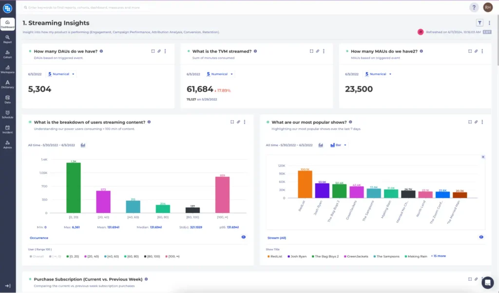
Streaming Media

Companies that deliver streaming media have very specific metrics they need to keep track of daily or in some cases hourly. These dashboards typically include metrics like:

  • Total Viewing Minutes/Hours
  • Average Viewing Minutes/Hours per Visitor
  • Total Active Visitors
  • Average Sessions per Visitor
  • Total Viewing Minutes/Hours per Session

‍Often these metrics should be segmented by things like Subscription levels, Content Categories, Streaming Types (Live vs. VOD). Leveraging a no code dashboard enables product and content teams to understand how top metrics are performing, without writing or requesting code to be written.

Streaming analytics example

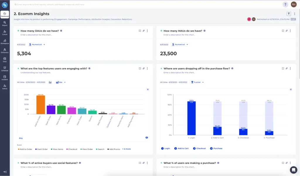
E-Commerce

E-Commerce use cases tend to favor funnels, paths and shopping cart type analysis to better understand if the platform is successfully converting visitors to buyers. When using a no code dashboard a team is able to quickly spin up several dashboards focused on each major area of engagement and purchase behavior. This typically takes the form of:

  • Total Purchases per Day
  • Average Order Value per Cart and Visitor
  • Loyalty Program Sign Ups
  • Marketing Attribution tied to Check Out Conversion
  • Conversion Rate of Search to Check Out

Often these metrics should be segmented by things like purchase history, device type,  country and loyalty program enrollment. Leveraging a no code dashboard enables product and content teams to understand how top metrics are performing, without writing or requesting code to be written.

Ecommerce analytics example

Conversion Funnel Analysis: The Complete Guide

What is funnel analysis?

Funnel analysis is an essential way to observe and describe a customer journey as a process with different stages that users go through. It usually involves several steps, from entering an app or web page to performing a particular action. It is called a funnel because of its shape that becomes narrower and narrower. By observing your funnel, and analyzing and adjusting its parameters, you will be able to improve conversions and customer satisfaction.

The funnel is an excellent tool for marketers, product managers, sales, and data scientists to understand user behavior better. Whether you wish to convert visitors into customers or you want your customers to buy more of your products, or even make them stay more in your app, funnel analysis is essential. Having a good understanding of your funnel is like using a GPS to guide you to a place you want to visit. It will show you the speed, the direction, and whether you’re on time or going to be late.

Conversion rates can help you understand the number of visitors who came to your website and bought a product or performed an action, such as watching a movie, downloading a document or submitting a lead form.

Why Are Conversion Funnels Important?

In product analytics conversion funnels provide the means for teams to look at specific user journeys through different lenses. Conversion funnels are often used to understand where the drop-off points and areas of friction are and then to measure the effect of any improvements that are being made. 

For example, let’s say your organization has a subscription-based business model and the main focus is to drive more subscriptions. Now this is a complex issue and usually there’s no obvious and straightforward answer, but funnels can help you start uncovering a solution. Here’s some typical questions to ponder:

  • Is the top of the funnel not wide enough? 
  • Maybe users aren’t being asked to subscribe often enough?
  • Are our campaigns working as expected? 
  • Is there a bug in the subscription workflow causing people to fail to subscribe? 
  • Do people get stuck on repeating a certain step in the subscription flow? 
  • Is the time to convert too long? 

You may notice that some of these questions can lead to solutions in product, some in marketing and others in engineering. Customer journeys in the digital age are becoming more and more complex and as a result require more collaboration between marketing, product and engineering in order to get them just right. Measuring the conversion rates at each step of the user journey can provide the objectivity required in these discussions to help make better decisions. 

Once you have a hypothesis you can establish baseline funnels and then run the experiments to measure the effect of your changes. Even better, once you have those funnels you can put them all on a dashboard and keep monitoring the conversion rates with every release to help you detect any anomalies or regressions. Now your teams can leverage all these insights to make data-informed decisions.

To sum up, conversion funnels are a powerful tool which can be leveraged to achieve multiple benefits:

  • better understand user behavior
  • define and optimize user journeys
  • run better marketing campaigns
  • improve collaboration between product, marketing and engineering teams
  • track the customer experience over time

How does funnel analysis work?

There are steps you would expect your visitor to take, from entering your website or mobile app to taking an action, such as making a purchase. With a simple funnel analysis, you can visualize your visitors’ steps to convert. Creating a funnel allows you to observe where exactly visitors or users are dropping.

First, you collect data through user tracking, SEO, email campaigns and other methods. Note that you need to have your data available and ready for funnel analysis. Then you define the steps that will be evaluated.

A simple funnel tracks how users convert from entering a landing page to checking out, or watching a movie, or another goal conversion. The funnel itself is usually presented as a bar graph. You will know where to look next when you see a decline or drop in your funnel. Usually, this is the time when an imaginary light bulb shines above your head. Understanding each step of the funnel and making necessary adjustments to see what works and what doesn’t will eventually lead to more conversions.

Funnel Analysis Stages

When creating a funnel there are a few things you need to consider.

1. What is the purpose of funnel analysis?

Our goal may be to generate more leads, to achieve more transactions, to make people more engaged with your product, or something else. If you provide a streaming platform maybe daily active users (DAU) are your focus. Maybe you just developed a new feature and want to encourage people to start using it or you made a tweak somewhere in a particular user flow and want to measure the impact. Did users get stuck on a particular step in a flow? How much time is it taking for them to complete registration, subscription, or payment? Is it perhaps too much?

Whatever your goal, the purpose of funnel analysis is to allow you to identify all the critical touchpoints and measure the user’s journey through them. Once you have the measurement you can start making changes and quantify their impact.

2. What is the conversion rate you expect?

This is your benchmark to work from. And at first it can sound like a chicken and egg problem – which comes first – the funnel or the expected conversion rate? But in reality If you don’t have a funnel already it is very hard to have a well informed expectation.

Let’s say you’ve finished an outstanding marketing campaign. You forecast a significant increase in conversions. What will your funnel look like? You can compare older funnels, say Q1 is your benchmark and you compare to Q2 sales. Now you can measure if there is an improvement or not and by how much. If, for instance, you’re starting a business in a new country, you can correlate conversion rates. Or you can compare conversions between different versions of your app after every release. If there is a sudden drop maybe there is a non-obvious bug which made it all the way to production?

Over time you may also discover that there is a seasonality to your business or there are trends happening on a daily/weekly/monthly level. This all goes to say that conversion expectations are always dependent on some additional context which the analyst brings to the table.

3. What could you improve to raise the conversion rate?

In other words – how can you optimize your conversion rate? Maybe an ad campaign, discount offers, introduction of a new product or new service, additional benefits. Should they do the work? 

You can A/B test your theories with real data examples and measure the significance of the experiments. Drill-down the different segments of users and how they compare and laser-focus on very specific user groups to target your improvements. Maybe one demographic isn’t responding to the ad campaign or is struggling with the adoption of a new feature? Or is it a country-specific issue which is positively impacted by your changes? You should use the improved results to achieve your goal. You can embed the analytical steps in your iterative process of bettering your product – just keep comparing funnels from different user segments as part of your release cycle to get a deeper insight into what the next step should be.

Please refer to Kubit’s Documentation to learn more about how to create a funnel.

Types of Funnels

Sometimes your customers don’t follow the path you have created for them. Users can enter your funnel in a variety of different ways. That’s why it is important to define your funnel. There are a few types of funnels:

  • Open funnel – where users could enter any step and still be counted in the analyses
  • Closed funnel – to be counted, a user should go from step 1 to step 2 to step 3, and so on. But there might be other steps, for example, between seeing a product and buying that product, a visitor might read a blog, compare products etc.
  • Strict funnel – as the name says it means there are no other steps between the steps you define and if the visitor is not following that route, he won’t be counted in the analyses.

Do’s and Don’ts of Funnel Analysis

Funnel analysis shows you whether people are dropping off, but it doesn’t tell you why they do it. Brainstorm the potential issues. Is the registration process too long and hard to fill, do you have clear messages and good product descriptions, are there too many steps and blanks to fill in before ordering a product, etc.

Quality over quantity – it is vital to not just attract visitors but also to make them stay. If you want to increase the quantity, then observe from where your audience is coming – social media, Google ads, Internet search, etc. Increasing the number of visitors doesn’t guarantee higher conversion. But, proper maintenance of the funnel will help get the most out of your new users.

Fine-tune your filtering! Some customers might be looking for a particular product while others are just browsing. Filter out those who are not your target.

Conversion windows. If you are selling shoes, from first opening a product page to placing an order, it might take a couple of minutes, but if you are comparing streaming services, it will take a little longer to complete the task. Keep that in mind.

Funnel Analysis Benefits

  • Allows you to determine key events on customers’ journey
  • Improve customer experience and satisfaction
  • Track any changes in your visitor habits
  • Helps you decide where you can increase budget and where you can scale back
  • Compare conversions between different dimensions like countries, genders, age buckets, app versions, and many other segments.

Example

A visitor is coming to your website, and he’s seeking products, then if the products are interesting enough, he will add them to the basket and then end up buying them. Let’s explore three stages of a user journey:

  1. Awareness stage – a user is on your website or an app, and they have a problem. You get the attention of your future customer or user.
  2. Review – the visitor is on the product/service page and scrolling up and down. He gets familiar with your product or service. Maybe he is comparing prices, using provided filters, and estimating how much he needs the product. Anyway, you’ll never know what’s in his head. As a result, he sees the solution for his problem in your website or app.
  3. Finally, he makes a decision. The visitor wants your product or service and makes a purchase. Congratulations, your visitor is now a customer.

That’s the ideal route, but sometimes visitors can go back and forth on the steps. Let’s dig a little deeper. Here’s where the true funnel analysis happens: If visitors are dropping off between 1st and 2nd steps, you should check whether there is enough information about the product. Are you providing helpful information like a help menu or a chat box, or anything visitors can use as guidance? If a visitor is dropping between the 2nd and 3rd steps, you should focus on prices, check competitors, and make sure you have a unique product or service. By observing where your visitors are dropping off, you can define your weak points and discover places where improvements should be made.

There is one final step – coming back or re-engaging. After seeing a customer making a purchase, you will want to invite them on another journey of being your repeat client. You can offer a discount on their next purchase, and sign for your newsletter, and like your social media page to support your cause.

Pro Tip

High drop-off usually means UI problems. But before scratching everything and returning to the drawing board, examine the audience who are dropping. Are they teenagers or elderly? Are they your targeted audience? If not, it’s a better idea to remove them from your funnel analysis.

Conclusion

Funnel analysis is a useful process that will support you on your way to building an exceptional product. However, it’s not the final phase. If you want to know the middle steps that your user or a visitor takes, consider doing a Path analysis and examining where your users are getting confused. Path analysis is an integral part of conversion rate optimization. We’ll cover this in a future post.

Want to see how Kubit can help you understand your user’s behavior? Get in touch with an expert to learn more.

Self-Service: The Future of Product Analytics

Data-driven decision-making continues to become crucial for companies of all sizes. Whether you are a startup or a Fortune 500 company, understanding your users’ behavior has never been more important.

In this pursuit of growth, companies turn to product analytics to collect and analyze the information that will help them provide a better digital experience, and win over new users. The only problem with this is traditional product analytics can be labor-intensive and time-consuming.

Luckily, there are new developments in the product analytics space with regard to the collection and analysis of user data. Companies now have the option to skip the SDK or ETL integration with no-code solutions that allow product analytics to connect directly with their cloud data warehouse, creating one single source of truth.

Kubit And The Future Of Self-Service Product Analytics

Below are some ways that Kubit is helping Product Analytics move towards a Self-Service future.

Era Of Analytics Is On-Demand:

Organizations are increasingly relying on getting the insights they need when they need them. This makes for real-time decision-making and a more dynamic approach to problem-solving. But, traditional Product Analytics has not allowed for this real-time decision-making to happen.

Kubit solves this problem with their real-time user dashboard and dynamic cohorting. With Kubit, your team can get the insights they need without having to wait for a team of analysts to find it for them. To learn more about how easy it can be to get instant Product Analytics insights, click here.

The need for team-driven analysis:

Collaboration is key when an Organization is trying to get the most out of their product Analytics. But, this collaboration can be difficult when non-technical team members don’t have the tools they need to find and share the insights that they are looking for.

Kubit helps to solve this problem by providing a team-driven platform. The best analytics decisions are made by groups that work from One Single Source of Truth. Kubit’s platform fosters team cohesion, efficient communication, and data-driven cultures with a simple but elegant platform.

Bottom Line:

Whether you’re a Product Manager at an early-stage startup or a Marketing Analyst at a Fortune 500 company, you know that good data is critical for making vital business decisions.

Today, the biggest names in the consumer enterprise space are betting on Kubit’s self-service analytics platform to close this gap and give their employees greater insight into how their products and user behaviors are performing.