Introducing Our Bold New Features: Query Builder and Dashboard
New Feature for building queries and improvement for our dashboard
If history has taught us anything, it’s that a good idea can come from anywhere.
Most of us have heard the story about the semi-truck that got stuck under a bridge–as the traffic continued to build up, all the adults with more specialized knowledge about trucks were frantically theorizing as to how they could ever possibly get this thing out from under the overpass. Then a little girl spoke up with a simple and effective idea: just let the air out of the tires.
As someone who has worked in data analytics for decades, I know there are many companies that have kept data investigation and solution discovery within a small group of specialized people–the adults thinking about moving the truck. And while those adults would have come up with an answer eventually, I couldn’t help but wonder what businesses could be capable of if they asked non-computer science experts for some data-driven ideas.
We’re solving that today with the launch of our Query Builder and Dashboard, two tools that businesses can use to democratize access to their data. Here’s how:
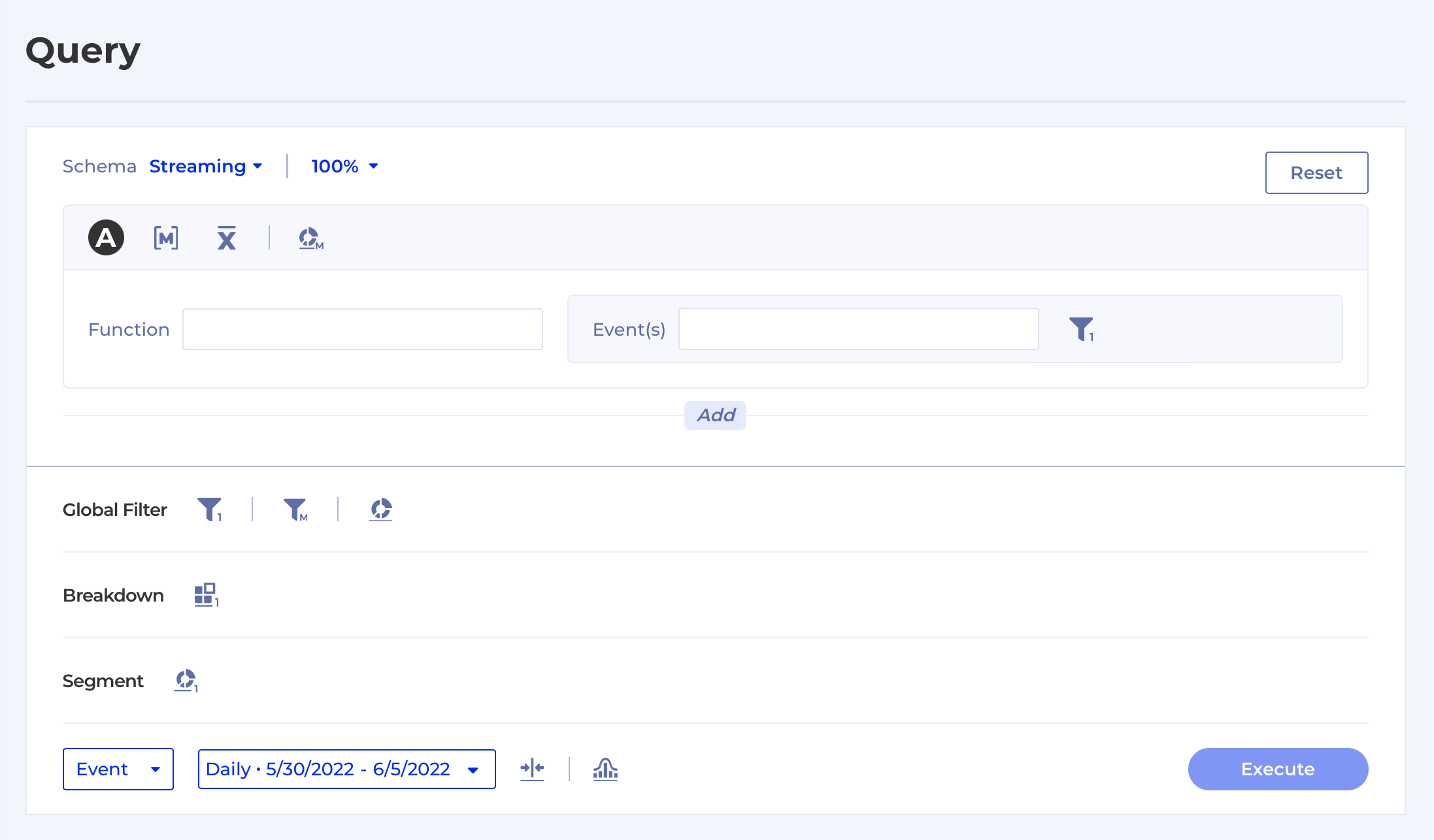
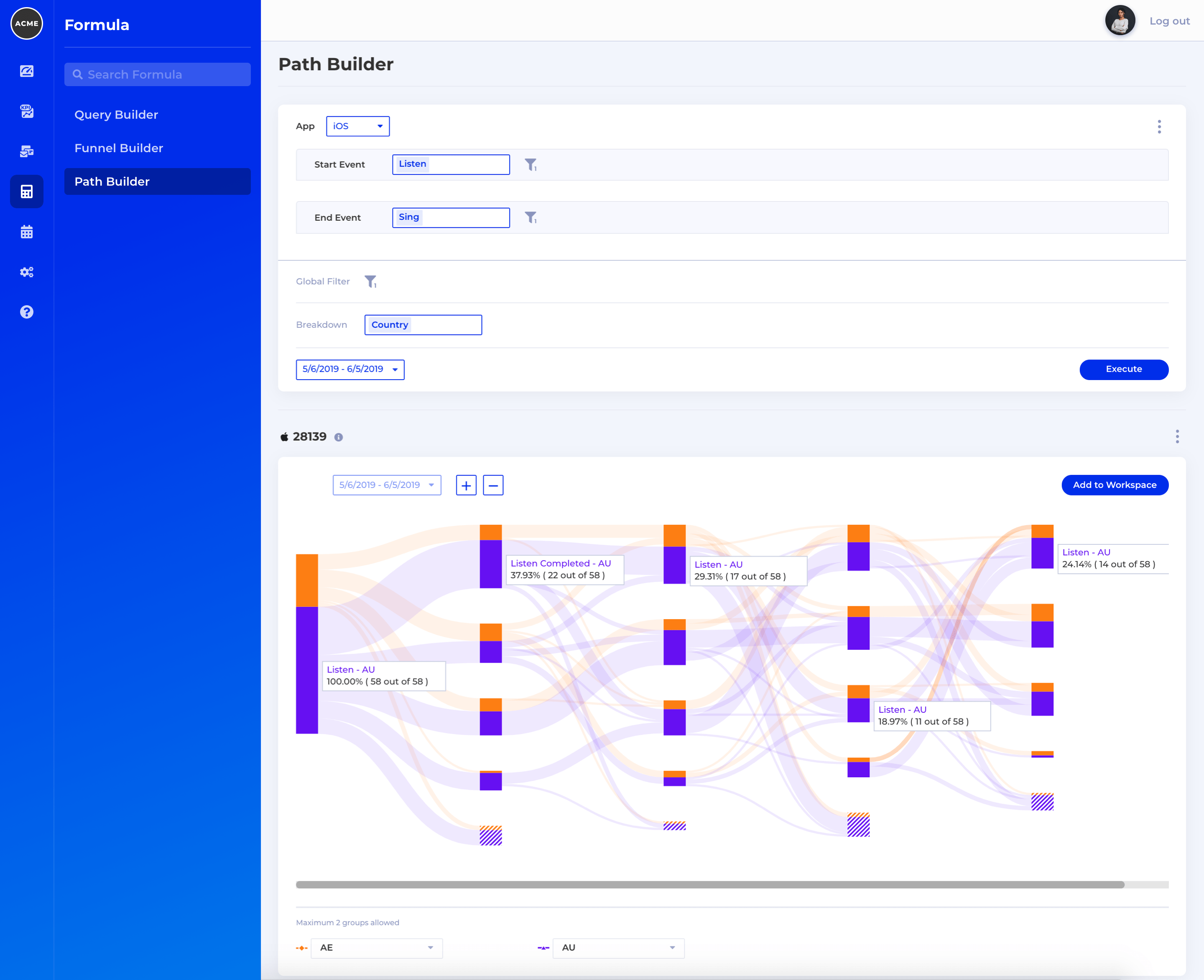
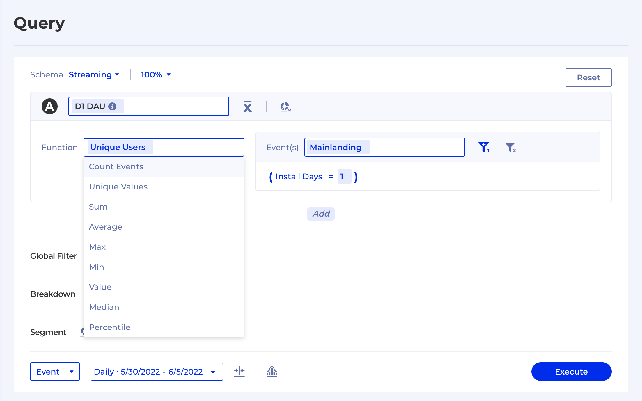
Kubit’s Query Builder makes business analytics possible–and easy–for anyone to ask questions and explore data. Built with the non-technical employee in mind, Query Builder’s intuitive setup lets users search data within a long list of pre-built measures–without having to know any SQL (query language).
The options are practically endless; users can search usage data by device, region, age, gender, app version, and much more. They can look at KPIs for Daily Active Users (DAU), trials, launches, uploads, and a host of other tell-tale user activities like listens, logins, and subscriptions. And, the formula builder saves and dates past queries to reduce time spent on duplicate work, and so pre-run queries can be easily mixed and matched repeatedly.
Let’s say Jason in marketing wants to know, in real-time, if the campaign his department just pushed out is having an effect on usage numbers. He knows the questions he wants to ask and gets the answers without having to wait for a day or more for the overloaded analytics department to pull the data. The Query Builder’s structure helps guide Jason as he inputs requests by data type.
But wait–unexpected (and immediate!) results show that something may be afoot in Canada, where stream starts are far lower than in any of the other regions. Thanks to Kubit’s augmented analytics capabilities, which provide insights for users, the platform lets Jason know that this is an anomaly–a huge power outage in the country. Instead of sending the data analytics department into a day-long goose chase to figure that out, he is armed with the information he needs to explain the results in tomorrow’s marketing meeting. And, he has the time to think of new ideas to help them catch up with the Canadian market.
As more team members use Query Builder, the more likely they are to uncover useful new KPIs, which they can add to shared or individual dashboards–another feature we rolled out today.
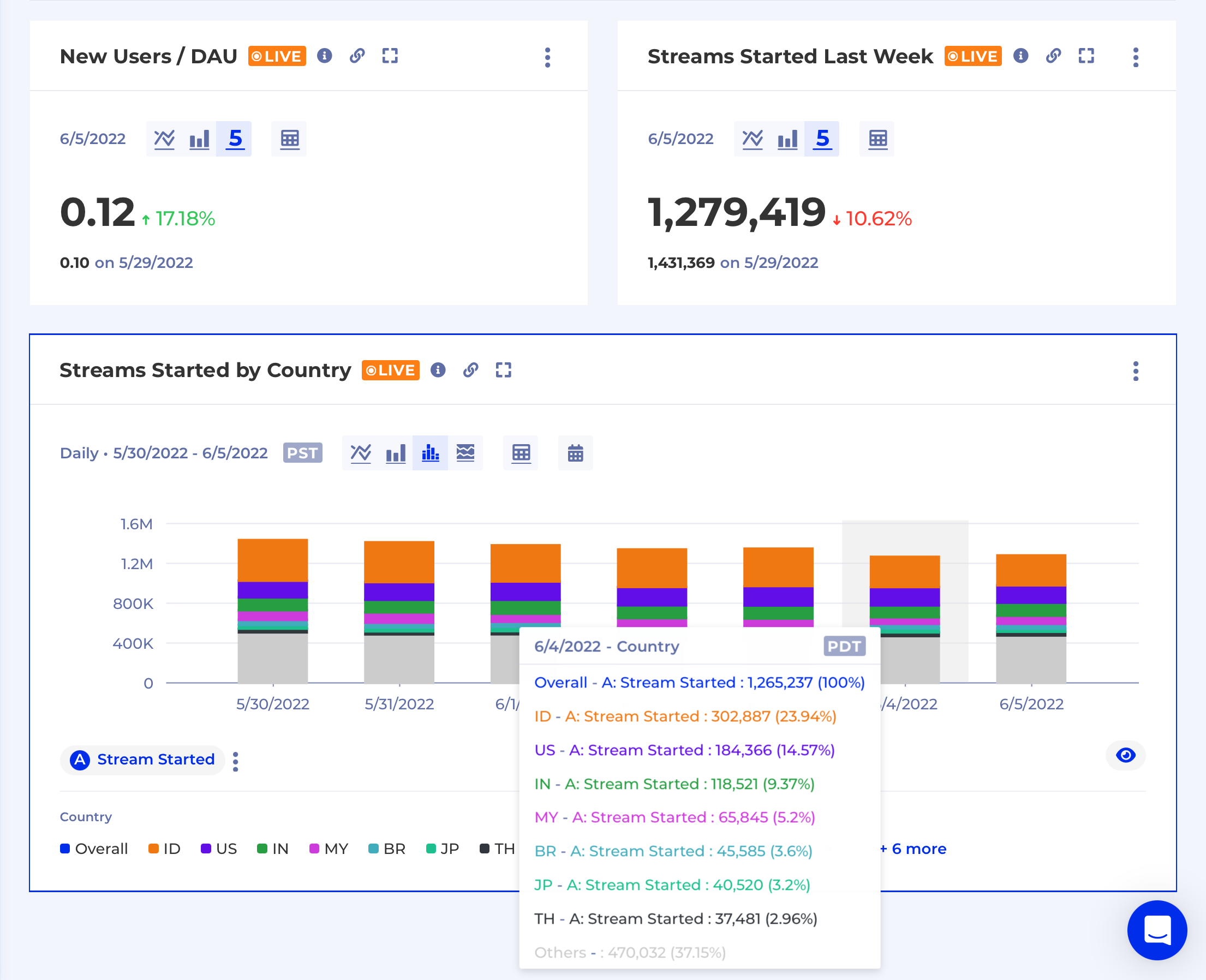
Kubit’s Dashboard is a user-friendly, visualization tool chock full of interactivity functionalities so that anyone can track the data they want, the way they want it–all at a glance.
Since everyone digests information differently, we built our dashboard with flexible functionality and customization at the forefront of our minds. Now, users can create, edit, and organize dashboards any way they want–whether it’s a bar chart or a numerical chart, and shared or private KPI tracking. The drag-and-drop feature means users can easily re-prioritize data charts (especially useful during presentations), and change formats by toggling back and forth or utilizing the drop-down menus to change what they’re seeing.
For example, Mary, a project manager at an app company, is tracking multiple KPIs and performance indicators. She can hover over any chart to quickly see isolated data—perhaps she wants to break down data points by time frame, and see it in both a line and bar graphs. The dashboard feature also enables her to see percentages and ratios between KPIs, which helps her to further understand the relationships between different user measurements.
Users can create and label new charts for their dashboard, all of which are downloadable. They also have a notes feature so that nuanced details remain in the same platform as the data. In one click, users can “clone” charts to quickly share with others, and share their dashboard link to let others view it–and keep team members on the same page. To get real-time data, all they have to do is hit refresh.
Here’s why we are (and businesses should be) really excited about this: regardless of the industry, companies are seeing an unprecedented shift in data technology. It’s easier to collect customer data today than it ever was, but that advantage has created its own disadvantages (like having more “big data” than you know what to do with). With the advent of Kubit’s Query Builder and Dashboard feature, we are building a bridge across a desperate canyon: data-driven questions and their data-powered answers. It’s a new era of business intelligence.
Now, let the air out of those (database) tires.